Posts Tagged ‘Donald D. Hoffman’
British Abstract Painting in the Seventies: Stagnation or New Possibilities?
In the seventies abstract painting in Britain was in crisis. At least that’s how it seemed to some. If during the sixties it had become hegemonic that privileged position was on the wane. Peter Fuller would shortly declare American abstraction to be not much more than a CIA plot, within the discipline of painting figuration was in resurgence, whilst outside it performance art and conceptualism were fast becoming the dominant art forms, leading to the stagnation of abstract painting. The exhibition New Possibilities, Abstract Painting from the Seventies, a show of fourteen painters from the period (all still painting today), at the Piper Gallery counters this viewpoint, demonstrating that instead abstraction in this decade was vibrant and varied.

Installation shot (right. Gary Wragg, Carnival, left Trevor Sutton That Swing.4.K). Image by courtesy of The Piper Gallery
In her gallery talk co curator Sandra Higgins introduces Gary Wragg‘s Carnival (1977-79) as the show’s opening statement, as if it were shouting “this is abstraction!” not a representation of the world, rather a celebration within in it, the gestures and colours resonant of graffiti and the detritus of building sites, brimming with the energy and excitement of the city, simultaneous with its squalor and vulnerability.
And if the opening statement is a shout, the next is almost a whisper: Trevor Sutton‘s That Swing.4.K (1979), five foot square, bisected by an off vertical line achieved by joining two canvases black to the left and blue to the right, with the green of the painted edge just showing as a narrow line down the (off) centre.
Turning to the Untitled (1973) geometric painting on paper by Patricia Poullain, Higgins tells the story of her continuing to paint every day in her summer-house, facing the countryside, whilst making ‘pure painting’, both “in nature” and “against nature” at the same time.
In Alice Sielle‘s 3D Blue and Gold Segments (1978), drawing, within a shallow illusionistic space is more prominent. Approaching Op Art, carefully rendered three-dimensional abstract objects (segments) combine together on a grey ground to make an image that is more than the sum of its parts, appearing to generate light as much as reflect it. Sandra Higgins recalls asking her how she managed to paint it with such precision, and receiving the answer “I don’t know”.
The one painting I came here specifically to see was Purple Heart (1979) by Mali Morris. If Carnival is a shout and That Swing.4.K is a whisper then this is a song.

Mali Morris, Purple Heart, 1979, Acrylic on canvas, 167 x 165.5 cm, Image courtesy of Piper Gallery
The purple heart shape of the title takes up nearly half of the canvas, and around it smaller, colour/forms harmonize, mediating, for me, a set of binary oppositions like hard and soft, head and heart, colour and line, form and content, object and image, words and music.
In Graham Boyd‘s Descender (1976) the large canvas has undergone a process of masking and spray painting resulting in a series of subtly gradated narrow bands of rich colour creating an undulating optical space.
The earliest painting in the show, Albert Irvin‘s Glow (1971) has decorative colours that echo the lines of the support whilst also looking virtually formless, the liquid paint poured, sprayed, splattered and at times approaching the condition of a gas.
William Henderson‘s marvelous Funky Black and Catch Me (1978) is as much built as painted. Rainbow bands on a black ground multiplying from left to right, until at the right hand third the space is completely filled, and the space itself seems to bend and deepen towards that side. It is an exciting painting, the visual equivalent of jazz ( be-bop rather than cool). Looking at the painting with me he explains how he achieved the rainbow stripes by loading a brush with contrasting colours and drawing it across the canvas. Either it worked or it didn’t and he would have to do it again.
Perfectly situated at the end of the gallery so it can be seen from many distances is Barrie Cook‘s spray painted Blue, Red and Yellow Grid (1977). As I journey towards it I am unsure how much of what’s happening is optical and how much is physically there.

Installation image by courtesy of The Piper Gallery
Black vertical stripes are flanked by blue and violet creating an optical central horizontal light blue line – I think.
There’s opticality even in Jeanne Masoero‘s Basis for Light, Series II, no. 7 (1977) the nearest work in the exhibition to ‘systems art’. Comprising built up layers of torn white paper and PVA glue in loosely alternating rectangles of horizontal and vertical lines and resembling ploughed fields seen from the air, the structure is both accentuated and denied by the way the light and shadow is distributed over the uneven surface. Momentarily, I feel sure I see colours on that surface …and then I’m less sure.
Tess Jaray‘s Petros (1979) indices a different kind of uncertainty, the muted colours at times only just distinguishing the repeated architecture based motifs from the ground on which they seem to hover.
Rush Green (1977) by Frank Bowling is arrived at through the pouring of paint, more gravitational than gestural, the flow of paint looking gentle and slow. The verticality of the image elicits figure associations, and the richness of colour leads me to relate to it as if it were a mummy or possibly even the Turin Shroud.

Frank Bowling, Rush Green, 1977, Acrylic on canvas, 167.6 x 71.1 cm. Courtesy of the artist and Hales Gallery
Whilst Bowling achieves an ‘all-over’ anti-composition, by contrast C. Morey de Morand‘s masking tape rectangles in There is Always More (1978) are deliberately placed in four colour groups against a shifting red ground.
Finally, six Desmond Rayner gouaches offer yet another version of abstract painting: Art Deco inspired geometric patterns that could be mistaken for screen prints if it weren’t for the uniqueness of the colour mixes. Interested in invention rather than personal expression he sees the works as entertainment, encouraging us to “relax and enjoy (them) at surface level”.

Installation shot, Desmond Rayner Gouaches, Courtesy of The Piper Gallery
Seeing the diversity of these works I find agree with Sam Cornish who, in the catalogue essay, argues that this exhibition shows that
The break up of the Modernist consensus and the rise of the expanded field did not result in abstraction stagnating but rather in a period of complex, even frenetic experimentation, of new possibilities.
But what of continuing relevance? In the same essay Cornish brings attention to Mali Morris’s “materiality and touch”, which reminds me of the recent article by David Sweet at Abstract Critical where, questioning the relevance of “the kind of average lyrical abstraction of the late colour field period” and highlighting the importance of detail in the era of high-definition he partially equates touch with detail. Commenting on a 2012 painting by Morris he describes her intelligent handling of the “resolution that detail brings”.
And glancing up at my HD TV whilst writing this, I am distracted by a programme about the popular singer Tony Bennett, suggesting that his refusal to update his material was later interpreted by younger audiences as “cool” leading to his recent return to popularity. Could it be that Patricia Poullain also remains relevant but this time through her persistence, doggedly following her very specific, repetitive, line of enquiry?
Patricia Poullain, Untitled 1973, Acrylic on paper, 50 x 50 cm. Courtesy of The Piper Gallery
In suggesting that Morris’s work stays relevant by updating itself and Poullain’s by staying the same I am no doubt having my cake and eating it, so let me suggest a third way in which these abstract painters may continue to be relevant. Advances in the field of cognitive science made since the seventies could make some of these paintings more contemporary now than they were then. Barrie Cook’s work for example has affinity with experimental findings made recently into how we construct colour, findings that challenge some of what we thought we knew from Sir Isaac Newton, the philosophical implications of which are explored by Donald D. Hoffman in his book Visual Intelligence, How We Create What We See.
Indulging in these closing speculations I find that I am making a claim not only for the vitality of abstract painting in the seventies but also for the new possibilities abstraction may yet have in store.
New Possibilities: Abstract Painting From The Seventies is on at The Piper Gallery, 18 Newman Street, London until 21 December 2012.
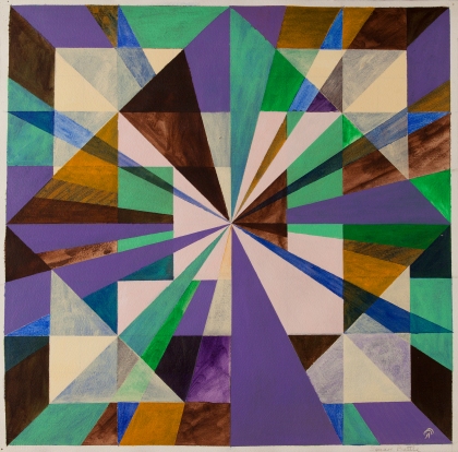
Tetracting!

Drawing: Networked Double Tetractys, permanent marker on paper, 8″ x 8″
Edge-induced colour spreading
In Flank transparency: The effects of gaps, line spacing, and apparent motion by Daniel Wollschla, Antonio M Rodriguez and Donald D Hoffman, (in Perception, 2002, volume 31) , they use the term neon color spreading to refer to “the perceptual phenomenon of color that seems to disperse from image elements into their surround, thereby creating a subtle neon-like veil”, explaining that “the observed coloration overcomes `real’ figure boundaries and typically covers an area confined by subjective contours”. Here’s an example:

The authors contrast this classical neon-color-spreading phenomena with edge-induced color spreading as discussed by Pinna, Brelstaff and Spillmann (in Surface color from boundaries: A new `watercolor’ illusion‘ in Vision Research 41, 2001) where edge or flank-induced coloration does not display the neon-like quality and much more resembles pastel surface colours or a watercolour wash. In doing my own drawings I have become especially interested that the area covered by the `diffused watercolor’ can be much larger than the area that might usually be the case with neon color spreading. And I keep asking myself why I have never come across this before.

The light green ‘ground’ in this image is constructed by you the viewer in response to the colours that flank the drawn figures. Note that the ‘ground’ also shifts to ‘figure’, creating an alternative view of the image.
colour and light
Sir Isaac Newton’s experiments with prisms, where white light passing through a prism emerges in a spectrum of colours like a rainbow led him to conclude that “Colours in the Object are nothing but a Disposition to reflect this or that sort of Rays more copiously than the rest.” In other words, light is composed of different rays (we might now say different frequencies), a given surface reflects certain rays and absorbs others. If it reflects low frequencies and absorbs high, then its colour will be at the red end of the spectrum whereas if it reflects high frequencies and absorbs low then it will be towards the blue end of the spectrum. However, a study of simultaneous colour contrasts shows that the “same colour” will look very different depending on its context. So “pattern of reflectance = colour of surface” is not the whole story, there is the ‘subjective’ side of colour construction to take into account.
Donald D Hoffman, in his book Visual Intelligence shows just how complex a process this is, and suggests some of the rules we use to construct the colours we see. I borrowed one of his experiments/demonstrations (which he credits to Christoph Redies and Lothar Spillmann) for my painting Glow Grid, where coloured discs are constructed by the viewer:

and more recently I have been playing with colour mixing and wondering about how much of this takes place on the canvas (out there) and how much takes place optically (in here).

In the New Testament (of all places) we read that “the light of the body is the eye” emphasising not the objective (out there) source of light and colour (as perhaps J.M.W. Turner did when he said “the Sun is God”) but the subjective “in here” construction of it.
Selections From Dismissing God by Donald D. Hoffman (via Paying Attention To The Sky)
I am thoroughly enjoying the writing of Donald D. Hoffman
you could say I am a big fan
He writes about visual perception and how we construct the world in which we live. No room for gods in this world view?

