Posts Tagged ‘Kenneth Martin’
Generator Discussion
On the final day of the Generator exhibition, Duncan Brennan from Kaleidoscope Gallery, posed a few questions for discussion by the artists. Here is an attempt at recovering some of the conversation from notes. I wasn’t actually there. Think of it as an exercise in constructed memory. I have also taken the liberty of adding some thoughts of my own. I think that the questions alone are generative enough to be worth a post.
DB: How would you define the type of work in this exhibition?
HH: It is work that is created by using a mathematical or logical system
CP (from the exhibition introduction): artwork that is by nature ‘generative’, created once an artist cedes control to an external system or set of rules. The artwork thus results not from the wholly instinctive decisions of the artist, but is formed by objective rules or logical instructions that shape its process or material outcome.
DB: Can you talk about some of the defining characteristics of generative work?
AP: In his 2010 paper Program, be Programmed or Fade Away: Computers and the Death of Constructivist Art, Richard Wright summarises Kenneth Martin’s division of systematic work into three types : 1) the completely predefined system which once set in motion can generate work independently of any further input from the artist. 2) a system that may be initially predefined but is then constantly altered through feedback, bringing into contact with other systems, the ‘program’ thereby being written in conjunction with the work itself. 3) the system which builds up from a primary act without any previous planning, like a self propelled aggregation of logical steps. The works in Generator may be closest to the first of these three definitions.
DB: What makes this different to other forms of abstraction, such as constructivism?
AP: I think it is situated within the Constructivist tradition, though that historical moment has passed. British Constructionist and Systems Group artists saw the need to abandon its utopianism and showed how art could be generated by a numerical or mathematical system. It is different from expressionism, which has been another strand within abstraction.
HH: Constructivism was /is a more political form of creation. Generative art has its own roots, the methodology and interpretatons are unique to the individual
DB: Would you agree that rules need to be constructive rather than restrictive?
HH: Everything in the world is generated by rules. Painting a landscape has rules that govern the outcome of what will be a recognisable presentation. Working in the constraints of rules or systems allows the artist to interpret data and input in many ways. I use a system at work which plots the movement of the railways in graphic representation. I use the variations in the programme to generate some of my own work, the patterns vary according to the input in spite of the fact that the system itself is governed or regulated by a computer.

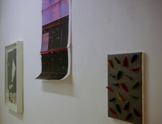
Left Christina France, Equilibrium 1 and 2, pigment, archival digital print on German etching paper, 80 x 60 cm. Right Hanz Hancock, Untitled, 2015, mixed media, 51 x 51 cm
DB Can a computer make art?
HH: A computer can make extremely complex patterns/can create algorithmic sequences , it cannot make emotional decisions as to what looks good. That is down to human preference. I/we make sequences based on numerical systems, something working within the grid. Patrick created several works that generated themselves: a module was sent into rotation within a grid, in a concentric spiral and each module had a graphic relationship or difference to the positioning of the the other. However, because of the repetitive nature of the system, repeating aggregations became apparent, appearing almost at random within the matrix, i.e. the formation of pattern. This could then be sampled and magnified into groups and in turn, work was made from tha , a sort of generative mechanism or device to generate pattern.
JI: Yes, computers can make art but humans make computers. The computer is just a tool. An algorithm, performed by a computer, is just a mirror of a set of processes condensed in time and space. It is in this compression that the art lies.
AP: Your question reminds me of a story told by that great systems thinker Gregory Bateson, of a computer programmer in the days of big mainframe computing, who wanted to know about mind in his private large computer. He asked it, “Do you compute that you will ever think like a human being?” The machine then set to work to analyse its own computational habits. Finally, the machine printed the answer ticker tape style, as such machines used to do. The programmer ran to get the answer and found, neatly typed, the words: THAT REMINDS ME OF A STORY”.

James Irwin, Silicon Binary Progression (ii), 2014, HD video, monitor, media player, dexuob speed frame, MDF, 4 mins 15 secs
DB: Has the computer changed the focus of generative art? Is the computer to generative art what the camera was to representational art?
JI: Good question and there’s probably the same analogue relationship between the computer and generative work, and the camera’s photographic image. It’s not that simple though. Using the computer is just one way of working generatively. It isn’t definitive of generative art.
HH: Human beings create programs by which the computer will create images, but the camera can only record the image which can then be manipulated both outside of the camera and electronically inside. The human brain has always generated images and pattern forming/art. The computers is a tool not a focus, as is the camera for human imagination.
AP: I have my doubts about that little word “just”, as much as I do also about the idea of the computer as a tool. It seems to me that the computer, and indeed technology more generally, gets characterised as just a tool to make it seem smaller than us and in our control, like a spanner, a hammer or a paint brush, when in fact, as a system it obeys its own rules, and incorporates us into its usage. Nevertheless, in Generator it is the contemporary analogue, rather than digital, ‘programmatic’ that is being explored. The computer programme is often used as a metaphor for the human processes of thinking/doing, so we might wonder what the programme is for activities like walking, or breathing, or even attempt to codify neuro-linguistic programmes for performance excellence in any particularly field. In this exhibition the systems that generates the artwork are thought of as analogue programmes, which have clearly been around a lot longer than have computer programmes, but only now that we have the computer are we able to utilise the metaphor for thinking about thinking. I like the circularity of it.
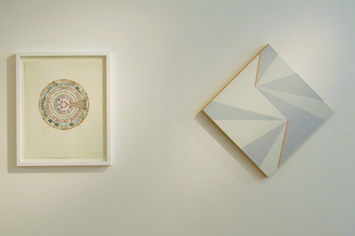
Left, Mary Yacoob, Modular Hakka House, 2014, ink and graphite on paper, 50.8 x 40.6 cm, Right, Katrina Blannin, blackgreyblackgreyblackwhiteblackwhiteblackwhite-orange 50, 2015, acrylic on linen, 70 x 70 cm
DB: What characterises good generative art? Is it necessary to be either or both conceptually and aesthetically strong?
AP: I think Natalie Dower and Jeffrey Steele answer this best. Here’s Dower in an interview with Patrick Morrissey: “If the input that has generated the idea does not translate into valid visual terms I do not accept it. I have had intellectually interesting ideas that I have had to abandon for that reason”. And here’s Steele in an interview with Katrina Blannin: “…something has good Gestalt or bad Gestalt — has it got a clear shape to it? I can look at one of my paintings and see whether it has good Gestalt or bad, and this has happened occasionally. A clear process of abstract thinking should lead to a satisfying visual Gestalt. I don’t necessarily “reject” or stop working on a project when this is not happening, but it bothers me, and I want to know what is going wrong”.
DB: Are you looking to formalise the human aesthetic?
JI: A human aesthetic is wide reaching and all encompassing. Defining a human aesthetic as work that shows signs of ‘the hand’if that’s what the question suggests, is too limiting”
AP: Maybe formal logic and formal linguistics, abstract languages, like mathematics, all pertinent to computer programming, have close connections to the formal ‘language’ of abstract painting.
DB: Does any of your work explore any of the hypotheses, the rules and processes of the scientist? Do you think generative art work like this can inform scientific study?
AP: I was going to say that whilst likely to have been informed by scientific study, the relationship is unlikely to be reciprocal, but then I remembered that some of the truly fascinating discoveries made in the last few decades in the science of visual cognition was discovered by map makers in the seventeenth century, so I guess you never know!
Chance and Order at Eagle Gallery
The Chance and Order exhibition at Eagle Gallery takes its title from Kenneth Martin‘s early 1970s series of works, that he later developed into his Chance Order Change series, magnificent paintings in my view. The show brings works from the 1960s and 1970s by the British Constructionist and Systems Group together with more recent works by artists who currently draw upon this tradition. It is a mystery to me that this incredibly rich field in British art has been somewhat overlooked, when the paintings, drawings reliefs etc. of Kenneth and Mary Martin, Jeffrey Steele, and many others in this grouping are among the finest produced anywhere in the world. That they are being appreciated now by more than a generation of younger artists seems absolutely appropriate.

Natalie Dower, Root Two Spirals no 2, 2014, oil on canvas 86 x 122 cm. Image copyright of the artist by courtesy of Eagle Gallery
The two 2014 paintings by Natalie Dower are wonderful, both exploring the properties of Root-2 rectangles, which can be halved and halved endlessly and each time the rectangles will be of the same proportions. In these paintings Dower employs a rotating or spiralling movement to position repeatedly halved rectangles or triangles, (the triangles being derived by halving the rectangle diagonally), differentiating them using a nine colour sequence, in each reduction the triangle and rectangle shape share the same colour. There are nine moves, so nine colours are duplicated on two spirals tracks, one situating the triangular units and one the rectangles. On the first move the two units occupy the same area but in the subsequent diminutions the first two moves are in the same halves but then the track of rectangles curves inwards whilst the triangle track follows the periphery. The smaller scale units have priority over the previous, larger ones. If I am not mistaken Two Spirals No.2 is the inverse of Two Spirals No.1, in the same colours, used in different order. I read somewhere that the colours are “muted”, but that’s not really my experience, white may have been added, they are not quite primary and not quite secondary colours, but to my eyes the colours are high, with turquoise, cerulean blue, orange and yellow contrasting with Payne’s grey, white and a neutral base. The logical relationship of shapes and the sequential ordering, is combined with the intuitive, in the form of two sets of choices: the system being explored and the colours used, an inventive fusion of chance and order that I am finding in each of the works in this exhibition.

Kenneth Martin, Chance Order Change (2 Drawings),1978, pencil and ink on paper, 21.5 x 29.5cm. Copyright Estate of Kenneth Martin, Image courtesy of Annely Juda Fine Art, London.
There’s a rotational theme too in the Kenneth Martin, Chance Order Change drawings, the paper having first been marked with numbered points, moving clockwise around the rectangle, the artist generated the lines by taking numbers, two at a time, at random out of a bag. A line was drawn between each successive pair of numbers as they were picked out. Chance determined the sequence and the number of parallel lines, the first drawn would have one line, the second two lines and so on. Change was initiated by rotating the drawing by 90 degrees and repeating the process for three rotations. The result is this intriguing network of lines which was then transferred to canvas. Order and chance may appear to be opposites, yet here their opposition is suspended, one being determined by the other.
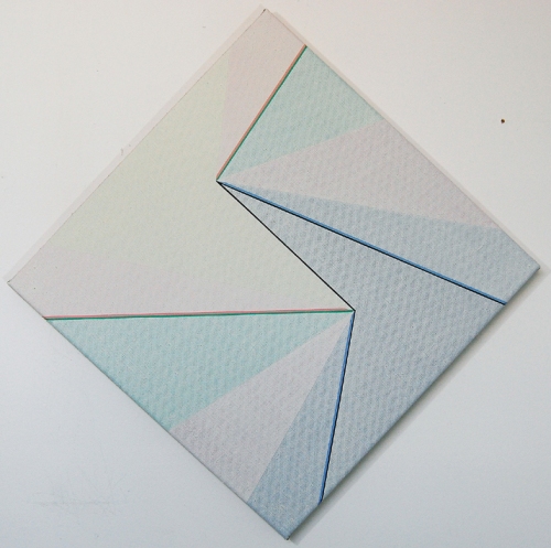
Katrina Blannin, Diamond Light 50 (tonal Rotation with Pink/Green: Blue/Black Demarcation), 2014, acrylic on linen, 50 x 50 cm, Image copyright of the artist by courtesy of Eagle Gallery, London
Katrina Blannin also employs rotation in her method, using the same double hexad starting point that has by now become familiar to regular viewers of her work, this time skewed to fit a square format, oriented to hang as a diamond shape, which is subdivided into triangles differentiated by a range of colours (yellow pink green red blue and grey) that get darker and then lighter in rotation. Narrow demarcation lines are also added. There is a sense in which the careful definition of parts leads to accurately separating flat areas of colour, yet they immediately set up fascinating, shifting spatial relationships that create ambiguity. I think of them oxymoronically as precisely ambiguous. There are three paintings in sequence here increasing in size from left to right: 50 x 50 cm , 60 x 60 cm and 70 x 70 cm.

Mary Martin, Drawing for Cross 1968, pen on paper 25.3 x 20.3cm. Image Copyright: estate of Mary Martin, courtesy of Annely Juda Fine Art, London
Mary Martin‘s drawing for Cross, a preparatory study for the magnificent stainless steel on wood relief that won the John Moores prize in 1969, is a diamond shape on a square. In the drawing Martin uses six iconographic figures, one for each of the six positions of her basic unit of a half cube, cut on the hypotenuse, faced with stainless steel, that she used in the relief. The half cube, placed in six different positions and and then arranged in a variety of sequences results in an amazing complexity of form, as demonstrated in this beautiful drawing. There’s a similar strategy being followed in Jeffrey Steele‘s outstanding Six sets of 7 x 5 half circles in cinematic rotation. It does “what it says on the tin”, yet whilst the descriptive title may sound somewhat prosaic, the visual experience is surprisingly poetic. And this is where I am supposed to say that their approach is not “mechanical” or “formulaic”, because we seem prejudiced towards those ideas, preferring instead the illusion of freedom. So I am going to say the opposite: it is formulaic, mechanical, digital (though not virtual), and that’s good! These drawings and paintings are totally contemporary, dealing with the issues of our day, without ever representing them or commenting upon them. What we are faced with in these works, precisely because of their programmatic or systematic formality, are the big, dare I say existential, questions to do with freedom and necessity, chance order and change.
Andrew Bick‘s OGVDS (Tilted Forward/straightened) v 5 is perhaps less systematic. Rather than numeric permutations of a single unit, we have more playful, serial variations on a theme, the theme being a particular grid arrangement that looks very different depending on changes to colour, texture, quality of mark and perceived depth. His work has been described as ‘gently disruptive and purposefully chaotic’, and it is easy to see this here. I like the gentle disruption in the spatial shifts as two large dark grey areas, an interrupted triangular shape at bottom left and a rectangular slab taking up nearly all of the right-hand half of the painting, first share the same literal plane and then snap into opposition, the larger shape receding in space in one interpretation, or jutting forward, in another, two orange irregular rectangles joining this game of push/pull, perhaps supporting the first interpretation slightly more than the second.

Andrew Bick, OGVDS (Tilted Forward/Straightened)V 5 , 2014, mixed media on linen on wood, 76.5 x 64.5cm, image copyright of the artist by courtesy of Hales Gallery, London
The Martins, in common with many of the British Constructionists moved somewhat away from painting towards constructed reliefs, Jeffrey Steele on the other hand, and it would appear that this is also true of Bick, Blannin and Dower, have stayed with painting, In a recent interview with Steele for Turps Banana, (Issue 11), Blannin asks him “Why is it important to develop …the historically charged process of ‘paint on canvas’?” In his answer Steele says “I have always wanted to try to justify the supreme importance of painting” contrasting the painter with the artist-as-manager who has works made in a factory, arguing that in the latter process “you lose the evidence of the ‘journey'”, adding that “for me the ‘journey’ is worth knowing and (its) traces… are important to see”. In every one of the works in this exhibition there is such evidence. Perhaps the show itself evidences the continuation of a journey, starting out with the British Constructionists and reaching into the future, an exploration rather than a repetition, yet quite possibly, ending as T S Elliot would have had it, where we started and knowing the place for the first time.
Chance and Order was on view at Eagle Gallery from 20 November to 19 December 2014
System Painting Construction Archive at Lion and Lamb Gallery
A detour on my way home from a day’s work brings me once again to that wonderful informal space The Lion and Lamb Gallery, in the back room of a London pub, where I get to see System Painting Construction Archive, curated by Andrew Bick.
Pint in hand, I view works by Andrew Bick, Stuart Elliot, Robert Holyhead, Clare Kenny, Maria Lalic, Karim Noureldin, David Rhodes, Cullinan Richards, Brandon Taylor, exhibited alongside a ‘museum’ of printed matter related to British Construction and Systems Art. In the gallery notes Bick explains that the artists were invited to “place their work alongside”, rather than respond directly to the archive.
Bick’s OGV (grid GW), does directly reference a Gillian Wise image shown in one of the vitrines, and acknowledged in the ‘GW’ of the title.
Its presentation, straddling the corner of the room, less directly references the Russian Tradition via Malevich’s famous Black Square. That tradition clearly also having resonance for Maria Lalic who has been working with the monochrome for some time. Here in her Sevres Blue Landscape Painting (Le Chemin de Sevres. Corot. C1855 – 65), she reintroduces the horizon line, but it is made by the joining of two monochromes, a lower one in brown and an upper one in blue. The non-objective is simultaneously posited and negated: two monochromes entirely abstract, yet it is impossible not to make landscape associations.
Clare Kenny’s Snow Blind appears also to toy with the propositions of ‘concrete’ and ‘representational’ . I think it is collaged from photographs of windows with blinds, the abstract lines and colours occupying my attention along with blotches or painterly stains, which could be read as ‘errors’ in the printing process, or possibly photographed (‘real’) snow flakes through a window pane. I am reminded of that old notion of painting as ‘a window on the world’, this particular ‘window’ being also physically blind-like, in that the paper support is folded, creating a material object that could function as a blind, obscuring the window.
The work by Cullinan Richards also has obscured ‘subject matter’. The title Paula Radcliffe in Disappointing 4th Place is taken from a newspaper article just showing towards the bottom edge of the piece. Possibly the newspaper was used to rest the art work on whilst it was being made and, getting stuck to it, it became an integral part by the end of the production process, almost as if the article became accidental content even whilst what was being constructed was rooted in the universal ‘content’ of the geometric.
Brandon Taylor’s Painting for CB is a construction with coloured wood pieces stuck to a painted grey ground on canvas that reads like a painting. I have the impression that the composition follows a rational formula but I can’t actually work it out. I find that I am counting the pieces, checking whether they are similar in shape and size and how many times each colour is repeated.
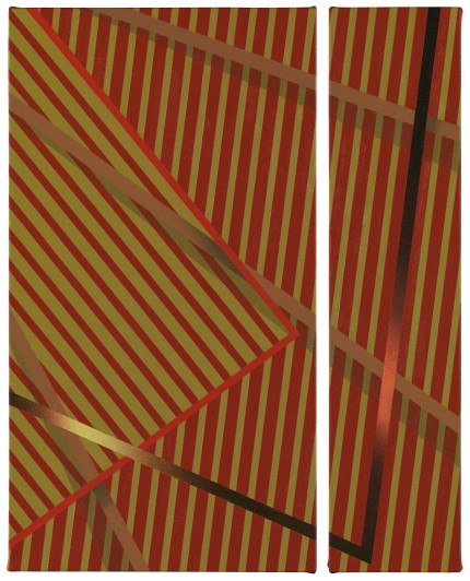
I am in a similar mode when looking at the paintings by David Rhodes and Stuart Elliot, attempting for example to work out in what order the lines in Rhodes’ 2.5.2013 (1) were masked and painted on the raw cotton duck. It’s an impressive painting that could have been executed in three sections, and even if it wasn’t I perceive it as comprising three informal ‘panels’, each with black and off-white lines in alternating directions, resulting in an overall “N” shape. It packs a punch, yet there is softness in the lines as a result of the way the paint has gently bled through the masking tape, and a richness of colour that is hidden by the description “black and white”. Likewise with Stuart Elliot’s Untitled (73), where blackboard paint has been applied to primed canvas before being stretched and the image, in so far as there is an image, looks to have been constructed by scumbling the paint over the bars of a wooden stretcher, creating impressions of the stretcher, not only at the edges but through the centre of the canvas, in numerous directions. Again, to say it is black and white would deny the subtlety and warmth of the colours that are nearer to warm greys on ochre.
In Robert Holyhead’s Untitled (yellow), a variegated yellow ground is interrupted by two, flatly painted, white triangular shapes reading as cut-outs, accompanied by a vertical line of a different yellow, running along the right hand edge branching out at top and bottom into two triangles causing the yellow of the ground to recede, and creating a lively ambiguous space.
The two beautiful drawings by Karim Noureldin, Evo (09-11040) and Evo (07-11009), both pencil on paper, look like a geometric starting point is being empirically explored or unfolded through a series or sequence. One of them has a central mass that could be a sculptural object in a space, whereas the other has a vertical zig zag, more rhythm than object.
My attention alternates between wall and vitrine. I read texts on or by Jeffrey Steele, Gillian Wise, Charles Biederman, Anthony Hill, Kenneth Martin etc. and, wanting to turn the pages, I have the sense of a past that is locked, only partially accessible via faded documents, memory and influence, as if the works on the wall are familiarly connected to the archive material or they can be interpreted as having evolved from a “constructive context”, some more consciously connected to the base than others, like the system formula that eludes my attempt to discern it, or like Noureldin’s drawings wending their way through various permutations, continually repeating and changing, awareness of the past leading to an informed openness to an unknown future.
System.Painting. Construction. Archive is showing at Lion and Lamb Gallery until 15 June 2013, and there’s a talk on 8 June at 5pm.
Line & Circle and Edwina Leapman at Annely Juda Fine Art
Although to speak about silence is to risk obscuring the very experience one might wish to elucidate, to keep silent is to risk it going unappreciated. I feel similarly about the wonderful exhibition(s) currently on show at Annely Juda Fine Art. I will be careful not to say too much, but I must say something. I will keep quiet about the wonderful space on the fourth floor with a skylight that is perfect for viewing the new paintings by Edwina Leapman, and say nothing about the beauty of the works in the Line and Circle exhibition on floor three. It’s ages since I saw Naum Gabo‘s linear constructions and constructions in space, and I had forgotten just how captivating they are. Was it in the 70s that there was a big show of these somewhere and we spent ages peering at tiny constructions in glass cabinets and glass covered plinths? And whilst looking, really looking (the response that Gabo achieves so consistently, not just for me, everyone seems to be studying so intently) it is silence that accompanies us.
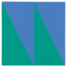
So, I shan’t say a thing about the amazing paintings here by Friedrich Vordemberge-Gildewart (an artist only recently brought to my attention by Terry Greene in a recent blog post), Composition N. 204, 1944/5, demanding silent contemplative viewing, like the Max Bill painting pura III, modest in size at just over a foot square, and containing almost no detail, the space divided in half down the centre and each half being divided diagonally from upper left to lower right resulting in four triangles, two in a colour approaching indigo and two in green, also resembling a zig-zag or ‘W/M ‘shape.
Impossible to determine which form is figure and which is ground, it shifts continually, from green figure against blue ground to blue figure with green ground, the colour relationship between them seeming somehow to be just right, as if there was such a thing as “correct”. Motion is arrested as I fix my attention on this object/image. It’s not just that the experience is a silent one, it’s more that the painting is the visual equivalence of silence: shifting, dependent on our perception of it, between presence and absence.
The other, much larger, Max Bill painting on show here, rotation around expanding white, a brightly coloured diagonally oriented canvas, equally interesting, seems a little ‘noisier’. Perhaps it’s all that visual excitation. Similarly with the marvelous painting by Kenneth Martin from his Chance, Order, Change series: although quietude continues to attend my viewing, it seems slightly ‘noisier’ somehow than pura III; It has a ‘buzz’ about it. Based on preliminary drawings, this series of paintings is highly programmatic and yet incorporates chance, which defines the position of the lines and their sequence. The points of intersection on a grid of squares are numbered and the numbers written on cards which are then picked at random. A line is made between each successive pair of numbers. I am unsure how the colours are determined but I think I am right in saying that where a line has been crossed by another its colour is changed.
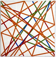
Kenneth Martin, Chance Order Change 20, Symmetry B, 1981, oil on canvas, 91.4 x 91.4cm, image by courtesy Annely Juda Fine Art
It’s a lively painting, and I am enjoying seeing it here in this room along with others that share with Martin an affinity with the tradition of constructivism (some more some less so: Ben Nicholson, Antony Caro, Josef Albers, Laszlo Moholoy- Nagy, Naum Gabo, Kazimir Malevich and Olga Rozanova ). I am also aware that it belongs in a series and I would like to see more of the series to place it within it’s own more specific context. But most of all I am enjoying the dialogue that this painting seems to invite me into. Perhaps that’s why I say its a noisier painting than some of the others: here I am talking to it about the process followed for its own production.
On the fourth floor Edwina Leapman‘s paintings also encourage thoughts about the process of making them, and the series context is also present: 15 paintings all made in 2012, all of two colours with a ground on which is drawn a sequence of horizontal lines. I have the impression that on each line the brush is loaded with paint and the paint deposited along the line until the brush is empty and then re-loaded to recommence on the line below. It looks as if the position of the line has been determined beforehand but the way the painted line looks is determined only by the process of drawing the brush across the coloured canvas.
In some of the paintings the ground and the line colour contrasts in hue and sometimes they match, but they are generally closely matched in tone. Although I feel drawn into that conversation about process, and even more so having seen the Max Bill painting pura III and wanting to compare and contrast them, they do then bid me to become silent again as I view.
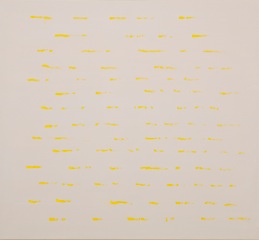
Edwina Leapman, Untitled, 2012, acrylic on canvas, 168 x 183 cm, image by courtesy Annely Juda Fine Art
They have amazing optical qualities, that must be ‘simply’ the result of the colour and close tonal relationships. That so much sensation can arise from so little intervention I find surprising, also that each painting has a distinct character of its own, vastly different from the others whilst in structure being entirely similar.
It’s true that appreciating these is something more for experience than for words, and also that their visual charge ( I want to say power but that suggests something much more brash and not ambiguous enough for these) is extremely difficult to put into words. So I will cease my speaking and continue to look on in silence.
Edwina Leapman New Paintings is showing until 28 March and Line and Circle until 23 March.
At the Point of Gesture at the Lion and Lamb Gallery
At the Point of Gesture opened at the Lion and Lamb Gallery on 23 February 2013 and runs until 23 March: curated by David Ryan it’s a show of abstract paintings and a video, by five artists Clem Crosby, Gabriel Hartley, Andrea Medjesi-Jones, David Ryan and Alaena Turner , each in their different ways exploring the potential of gesture, materiality and improvisation.
Maybe the exhibition title suggests that the works are only just at the point of gesture, like the Andrea Madjesi-Jones painting, where gesture seems to be included in a wider pictorial strategy, or perhaps that they have arrived at the point of gesture having set out from some other place, Clem Crosby’s work, for example, coming out of the monochrome tradition to a reconsideration of the role of drawing. Then again, in Aleana Turner’s Secret Action Painting 3 gesture is as much implied as it is physically present.
A point could almost be the opposite of a gesture, I’m thinking of pointillism where all those dots of colour negate the action of the sweeping brush stroke, yet once the dots are aggregated gestures of a sort do start to emerge. In physiological communication, to point is to gesture, and now I have in mind Grunwald’s amazing Isenhheim altarpiece where John the Baptist points at the crucified Jesus. Here the gesture refers to another, and I wonder if that might also be the case with gesture in abstract (non referential) painting, the minimum reference being to the act of painting itself, surely one of the points of the current Painting After Performance show at Tate modern.
Gabriel Hartley’s spray paint over impasto brushwork seems somehow to simultaneously both dissolve and emphasise the gestural mark-making, such contradictions being possible in a painting, even if nowhere else.

Gabriel Hartley, Frack, 2013, spray paint and oil on canvas, 76 x 61cm, Image by courtesy of Lion and Lamb Gallery
Approaching action painting, the individual marks almost lose themselves in the one gesture that is the finished piece. Kelp is almost white and Frack is almost black, and it’s difficult not to read them as monochromes, even though that tradition usually implies the repudiation of the gestural.
David Ryan’s Fame in California/1964, a small canvas in orange and pink has a central ‘sculptural’ figure flanked by indistinct forms or brushmarks and overlayed (or wrapped around) with a roughly painted green motif. In the top left hand corner a flat white rectangle asserts the painting’s edge, against which the rest of the action seems to recede in a pictorial, non-perspectival space. Because it is optical, the space is ambiguous, it shifts slightly and the pink and orange brush strokes or blobs and a line that traces the edge of the figure, now appear to occupy a place somewhere in between the white rectangle up front and the main form further back.

David Ryan, Fame in California/1964, 2012, Oil on Canvas, 30 x 36cm. Image by courtesy Lion and Lamb Gallery
I recall that I enjoyed seeing another David Ryan painting here in the summer of 2012, a lovely little thing in black white and greys, entitled Index. It had a white rectangle in the left hand corner, similar to the one on show today. In both works this ‘hard edge’ rectangle seems incongruous, as if, there, inserted into the picture, is another very different one, a monochrome again, a painting within a painting that has me consider what other kinds of picture this one could also have become.
In Clem Crosby’s Little Wing, magenta and black continuous swirling lines dance on a grey ground that looks like the result of all but erased previous versions of the loose network that forms the painted ‘image’. It’s difficult not to see it as existing in a kind of landscape, the loops at the bottom of the canvas suggesting a floor upon which the lines are ‘standing’, like a sculpture of string or tape.

Clem Crosby, Little Wing, 2012-2013, Oil on Formica mounted on Aluminium, 76.2 x 61cm. Image by courtesy of Lion and Lamb Gallery
I attempt to work out where each swirl begins and ends. In an image there is no such thing as a start and a finish yet the brush had to touch the support somewhere first and lay off somewhere too, but those entry and exit points become difficult to identify. In tracing the action with my eye and brain I also have something of the sensation of following with my hand and arm, for all I know they are actually moving, like when feeding an infant I find that I open my own mouth. So I notice that I am at the point of gesture myself, as if answering an invitation to explore the theme of the exhibition, as a viewer and also as a practitioner of abstract painting. The exhibition poses questions, for me, about the role of painterliness, offering a kind of counterpoint to my own preoccupation with systems. Here, painting is physical and the design is improvised, whereas my own practice is more cerebral and pre-planned. It’s not that a systems approach precludes chance and gesture, Kenneth Martin comes to mind as does Mel Prest whose gestural line drawings produced in a totally non-random fashion have the appearance of something random or ‘felt’, and David Ryan’s work already addresses the relationship between construction and improvisation. However, this show opens up for me some interesting questions and suggestions for future practice are starting to form.
One of the stated goals of the Lion and Lamb Gallery is to provide an opportunity for painters to curate visual essays that examine current practices in painting, and for me this show delightfully succeeds in this intention.

