Posts Tagged ‘Piet Mondrian’
“Conversations Around Marlow Moss” and “Parallel Lives”

Cullinan Richards, Savage School Window Gallery, 2008 ongoing text: MARLOW MOSS, perspex and aluminium light box, 18 x 140 x 300cm with scaffold stand (dimensions variable). Image by courtesy of the artist
I think there is something rather ironic about seeing a great big cinema-style sign heralding MARLOW MOSS, as if she were a household name, when in fact, although highly deserving of attention, she has been a little known figure, especially here in the UK, where she was born and spent the latter part of her life, only recently being recognised as one of Britain’s most important Constructivist artists.
The paintings and constructions, currently on show at the Leeds Art Gallery exhibition Parallel Lives (Marlow Moss and Claude Cahoun) are marvellous. I am particularly impressed by the two paintings White Blue Yellow & Blue, 1954, a finished and an unfinished version. Comparing the two, I gain information about her working method, how the lines are drawn in pencil and ‘filled in’ with colour rather than using masking tape, and how the white is applied last. (A gallery note contrasts Mondrian’s method of painting a white ground first.) Mondrian recognised her ‘double-line’ as a contribution to the visual ‘language’ of Neo-Plasticism. If she was a disciple, she was also an innovator in her own right. She was associated not only with Mondrian in Paris in the thirties but also with other international artists: Max Bill, Vantongerloo and Jean Gorin, being a founder member of the the Association Abstraction-Création in 1931. Yet returning to England in 1941 living and working in Cornwall she seems to have been somewhat ignored by other British artists, (unanswered letters to Ben Nicholson are included in the exhibition).

Marlow Moss installation shot. Image courtesy of Leeds Art Gallery.
The lightbox sign of her name is itself an artwork, by Cullinan Richards, in the window of &Model, the gallery almost directly opposite Leeds Art Gallery, announcing the exhibition Conversations Around Marlow Moss, curated by Andrew Bick and Katrina Blannin. The work Savage School Window Gallery, seems to create both an invitation and a barrier at the same time, as does all good art.
Something similar happens for me viewing the first painting I see on the inside of the gallery, a piece also by Cullinan Richards entitled Ian Poulter wore shocking pink, and including a newspaper photo of Poulter beneath an abstract composition, possibly based on (abstracted from) the colours in the photo. There’s the hint of a narrative, abstracted from a newspaper report, or perhaps even a headline, announcing a narrative that is not actually fulfilled, now that only the photo and title remain, of a piece that I must imagine actually existed. “Meaning” is context dependent, and the change of context creates something like a jarring sensation for me as I struggle to make sense of the object/image before me. Although I attempt simply to observe, I keep on interpreting, and my own processes of interpretation keep on coming to my attention. I am myself “abstracting” in the sense that I think Alfred Korzybski, Gregory Bateson and Chris Argyris may have understood the term, identifying at least these levels of abstraction: observation, interpretation and judgement. I judge the work to be good when it has this effect on me, of alerting me to my own seeing/thinking/abstracting and in doing so bringing me “back to my senses” where I notice the colour and shapes and materials, and also make an (probably incorrect) association with that 1915 Malevich painting entitled Painterly Realism of a Boy with Knapsack – Colour Masses in the Fourth Dimension, comprising only a black and a red square on a white ground. Already, I am interpreting again.

Left: Andrew Bick, Mirror Variant Drawing #1, 2011 -12, acrylic charcoal, digital print, spray paint and watercolour on cut paper, 135 x 135 cm. Right: Cullinan Richards, Ian Poulter wore shocking pink, 2012, oil paint, canvas, household paint, polythene sheet and newspaper, 113 x 85 cm. Image by courtesy of Andrew Bick
Any conversation around Marlow Moss must surely reference Modernism, abstraction, and specifically that strand of abstract art that we might group under the heading of Constructivism, developing as she did “a Constructivism from the Russian movement synthesised with Parisian Purism and Neo-Plasticism”[1]. The show at &Model brings together contemporary artists who have some form of dialogue with the positions of Constructivism, (e.g. its emphasis on non-objectivity or abstraction, its privileging of material over form, its critical engagement of the viewer), with British Construction and Systems artists forming part of a larger exchange artists are making now with modernist positions.
I find the large Black & White paintings by Jeffrey Steele here, entirely convincing. It occurs to me that even in 2 dimensions, prints or paintings, systems are never composed, always constructed. Hence no individual part has compositional preference over another, or over the whole, we have a lack of hierarchy, every part functioning according to the purpose of the system. Every part is “determined”, yet there is also a certain amount of “free” play provided by the near infinite variety of permutations, as well as in the unpredictable phenomena of “emergence”. The paintings are radically abstract yet also completely related to my lived experience of determinism within a system. If ever I needed persuading of the power, not to mention the beauty, of this approach these works amply achieve criteria, though you probably guessed that I am already fully persuaded.

Installation shot showing portfolio on tables and Jeffrey Steele paintings on walls, left: Syntagma Sg IV 117, right: Syntagma Sg 116, both 1991, pencil and oil on canvas, 122 x 122cm. Image by courtesy of Andrew Bick
I find David Saunders‘ sequence of six canvases entitled Black Transformation painted in 1973-4 similarly convincing, and I am surprised by the dates as the piece appears contemporary enough to have been painted this year.
I am interested also by other works from the same era: as well as the wonderful 1977 Rational Concepts portfolio of prints (7 English artists: Norman Dilworth, Anthony Hill, Malcolm Hughes, Peter Lowe, Kenneth Martin, Jeffrey Steele, Gillian Wise) there’s a delightful pastel colour study by Jean Spencer and two of Peter Lowe‘s reliefs from 1968 in perspex mounted on wood, both 23 x 23 cm: Permutation of 4 Groups of 2 and Permutation of 4 Groups of 3, in which rational order and faktura combine to produce objects of staggering beauty.
The influence of these artists on Katrina Blannin and Andrew Bick is self evident. Bick’s OGVDS-GW #2, directly quotes a work of Gillian Wise, and Blannin clearly follows a systems approach in her paintings. The wonderful paintings by Maria Lalic here Bohemian Green Landscape Painting and Sevres Blue Landscape Painting, both constructed by placing two landscape oriented canvases one above the other creating a “real” horizon line, also have visual similarities to the Jean Spencer study.

Installation shot, Left: Maria Lalic, Sevres Blue Landscape Painting, Front: Rational Concepts portfolio of prints, Back Andrew Bick OGVDS – GW #2. Image by courtesy of Andrew Bick.
Andrew Bick’s paintings may have a rather playful connection to systems, introducing what appear to be random markings, textures, colours, or materials, to a programmatic method of repeating the form and structure of a previous work. Sometimes the end result looks anything but rational, approaching Dada even! (Here, one of Bicks paintings is placed quite comfortably over a dishevelled stairway.) I might venture to suggest that his system is a stochastic one, wherein “a random component is combined with a selective process so that only certain outcomes are allowed to endure”[2]. There is also playfulness in his references to the history of abstraction: as well as his Gillian Wise quotation mentioned earlier, his placing of a canvas across the corner of the gallery must surely be a nod to Malevich that I interpret as humorous rather than ironic.
There’s something Dada-like in the interventions of Adam Gillam included in this exhibition, for example the placing of two sticks, pieces of wood or dowelling to which are attached high colour, painted false finger nails (from the nail salon next door), alongside the Anthony Hill pages from the publication Module, Proportion, Symmetry. It’s as if it fulfils the function of a disturbance, prompting a “double-take” in the viewer. Am I also reconnected for a moment to the actual environment within and around the gallery and jolted out of my art-trance? I don’t know why I am recalling Van Doesburg’s Dadaist alter ego I.K. Bonset, through whom he could participate in a very different kind of art making as a kind of foil for his own De Stijl Constructivism. Perhaps Gillam plays a similar role here.
I have written before about Katrina Blannin’s paintings, and seeing new ones here, I continue to be impressed by her work, not least by her commitment to her series of rotations of a bisected hexad. The variables are kept stable enough that learning can actually take place, yet there’s enough newness to create surprise and enjoyment.

Installation shot showing Katrina Blannin paintings and plinth with Adam Gillam intervention with Anthony Hill pages from Module, Proportion, Symmetry. Image by courtesy of Andrew Bick
What I get from Blannin’s paintings is the integration of intellectual and emotional experience, at least the part of experience that is to be had by looking at images and objects. Come to think of it, it may even be in the mediation of these two (image and object) that such integration takes place. I am trying to explain the felt pleasure (which I associate with emotion) that I am having when viewing or perhaps more accurately, studying (associated with intellect), these new works. I know it’s corny now to allude to “laughing out loud” but that’s close to the delight I am enjoying as I note the differences in scale, size and colour, and the sheer beauty of the objects themselves.
Over the last year or so, Blannin has introduced a demarcation line between the sections, and it adds first clarity and then nuance, on concentrated viewing, as the figure/ground shifts lead to constantly changing interpretations of the image.

Katrina Blannin, Bisected Double Hexad Rotation – Lemon/Delft Blue, 2014, acrylic on hessian, 30 x 25cm. Image by courtesy of the artist
The smaller works are painted on coloured Hessian, and whilst I am fairly sure that none of it actually shows through the opacity of the acrylic paint, I do think that it seems to add a new brightness to the paintings. The high colour of the Hessian on the sides of these immaculately painted objects casts a reflection on the wall and maybe that influences my perception of the colour, or maybe it’s simply the new colours that Blannin is using here that creates, for me, the impression of a change to a higher register or key.

Eva Berendes, Untitled, 2012, steel, brass. lacquer, 220 x 90 x 60 cm, image by courtesy of the artist
The imposing sculptural work of Eva Berendes and Liadin Cooke take up most of the ground floor of this show so I spend some time with them on my way out of the exhibition.
Berendes Untitled sculpture in lacquered steel and brass reminds me of a screen and functions like one in this space by dividing the room in half diagonally, yet it counters such a purpose in that it’s “see through”. I think of it as a decorative screen that neither decorates nor provides privacy: an attractive object that counters its own suggested utility.
Cooke’s large scale relief in felt and Perspex entitled Housement provokes similar contradictions, being imposing, weighty, sculptural in scale whilst also fragile, soft and ephemeral in material and colour. It simultaneously affirms and denies its own materiality.

Liadin Cooke, Housement, 2010, Felt, Perspex, 100 x 200 x 21.5cm. Image by courtesy of the Artist
All the works in this show can be situated in relation to the Constructivist tradition in which Marlow Moss was a worthy participant, but it’s a critical relationship, questioning and perhaps even extending it. Modernisms keep renewing themselves by continually criticising their own foundations. I suspect that new modernisms will continue to find inspiration in their chequered pasts, and often by re-evaluating the contributions of particular individuals and their contexts.
Conversations Around Marlow Moss continues at &Model until 18 July and Parallel Lives: Marlow Moss and Claude Cahoun, continues at LeedsArtGallery until 7 September 2014.
[1] Lucy Howarth The Lonely Radical
[2] Gregory Bateson, Mind and Nature, 1979
Zero Tolerance at Lion and Lamb Gallery
Borrowing its title from the terminology of manufacture and law enforcement, Zero Tolerance at Lion and Lamb Gallery, focuses on the extent to which three contemporary painters, Juan Bolivar, Nick Dawes and Katrina Blannin, employ systematic methodologies, or strict sets of rules, to construct their work. For me, it forms an urgent investigation into an aesthetic, highly relevant to contemporary life, that forms an alternative to the romantic/expressionistic tendency. I think systems aesthetics are being proposed here in other ways too.

Juan Bolivar, Anvil, 2013, acrylic on canvas, Perspex and sprayed MDF, 33 x 28 cm. Image by courtesy of Lion and Lamb Gallery
In Juan Bolivar‘s painting, Anvil, we have a system of signs, that remind me of a set of nested Russian Dolls, the outer one being the perspex framing device that functions both literally, as a transparent cover for the painting, and also as a signal to read the work as participating in the tradition of constructive art. The painting housed by the perspex frame looks like a postcard of a Mondrian, taped to a flat surface. We are presented with a construction containing a representation of a representation of a nonrepresentational painting. I think it is more paradoxical than ironic: a sign that reads “this is not a sign”.
Nick Dawes’ paintings are sign systems in a more literal sense. He appropriates ordinary road signs as subverted content in the style of the Readymade. Crossings features three gloss black “Level Crossing” signs on a matt black triangular canvas, as much recalling the “Give Way” sign as it does also the shaped canvases of late Modernist abstract paintings by artists such as Kenneth Noland or Frank Stella. Formalist painting becomes content as much as it also becomes analogous with popular cultural design. I am tempted to say that here a formalist abstraction has become a representation of a road sign that resembles a formalist abstract painting. If Clement Greenberg proposed that Modernist painting, in privileging form over content, could be defined as “the imitation of imitation as process”, I wonder whether in Post-Modernist abstraction the process becomes rather “the imitation of the imitation of imitation”.

Nick Dawes, Crossings, 2012, gloss houshold paint on acrylic on canvas, 213.5cm x 249cm x 8.5cm. Image by courtesy of Lion and Lamb Gallery
Both Bolivar’s and Dawe’s paintings, can be situated in relation to wider systems, whether high art or popular culture, just as they can to that other sense of the word “system” as in “systematic”, i.e. following a predetermined path, a procedure. And this is true also of Katrina Blannin‘s work in, I think, a different way. Clearly, Blannin is participating in that other tradition of abstraction that is connected more to Constructivism than to American Abstract Expressionism, the tradition that includes the British Constructionists and the Systems Group where the sense of “system” is a mathematical one. However there is also yet another sense of the word, that I want to explore, at least speculatively, for a moment, in relation to Blannin’s work and that’s the sense of “system” used in cybernetics, where a central concept is that of “feedback”, the process in which information about the past or present influences the same phenomenon in the present or future, forming a chain of cause-and-effect, a circuit or loop: output becomes input.
Viewing Three-piece Suite: Red/White (Double Hexad: Contracted, Root and Expanded + 123/321 Tonal Rotation with Shift), I have an experience close to ecstasy, and I deliberately choose the word for it’s inappropriateness when considering a piece that is mathematical, logical, rational. One of the things that I tend to do whenever looking at work of this kind is to count things. Before ever reading the title on the notes sheet I have counted the system or set of canvases that forms the triptych and then counted the triangular motifs that form the expanded system, noting how the white triangles are contained by a red line and the light grey ones by a black line leaving the dark grey ones unable to be highlighted, thus more readily becoming ‘ground’ or negative space against which the other triangles become ‘figure’. I have noted how the three tone/colours are arranged so that the same arrangement of lines (that also differs across each canvas because the widths of each canvas vary) is “coloured in” such that no colour/shape is repeated horizontally, in other words, there’s a tonal rotation with a shift. So, I’m doing all this counting and working out the logic of the piece and it might all seem so rational, cerebral, cognitive, yet I am using the word “ecstasy” that seems to belong more to our experiences of feeling and emotion.

Katrina Blannin, Three-piece Suite: Red/White (Double Hexad: Contracted, Root and Expanded + 123/321 Tonal Rotation with Shift), 2014, acrylic on linen, tryptich: 50 x 50 cm, 50 x 60cm and 50 x 70 cm. Image by courtesy of Lion and Lamb Gallery
But after a few moments of looking (and it does require a few moments, and real looking is also necessary, a mere glance will not do justice to the piece) I find that my emotional state has been affected, I have experienced a shift in state that approaches something of what I think we mean by a word like ecstasy. Where else does this happen? Doesn’t counting and emotion get conflated in our experience of anything that has rhythm? I am thinking of music and dance, where mathematical relationships become transformed into emotion. And there’s another context that I think is even closer to what’s happening to me in front of this painting and that’s the context of hypnosis where a trance might be induced through counting.
I could speculate that it’s the tessellating, the shifting of figure and ground, that leads to this shift of state-of-mind, (or emotional state), and this is where I come back to the concept of the “feedback loop”. Surely, it’s not really the object that tessellates at all. It’s a result of what the viewer does in relation to the object. At any one time, I am likely to see a different tessellation than the one you see. The object hasn’t changed, yet I am seeing something different to what you are seeing. It’s this system of object/viewer that Blannin’s paintings emphasise for me, and I wonder if what’s going on is that output becomes input becomes output in this continuous feedback loop and I experience this as fascinating, and even trance inducing.
In all these ways it seems to me that Zero Tolerance is an invitation to “think system”. Unfortunately, my brief review here is a bit late and the show has only a few more days to run. You can catch it at Lion and Lamb Gallery until 22 Feb.
Art and Jazz: Tomorrow at the Old Lockup Studio, Cromford
Tomorrow sees our one night only exhibition Salon1 at the Old Lockup Studio in Cromford, contemporary art by regional artists (including yours truly) with contemporary jazz by Corey Mwabma.
The connection between modern art and jazz goes back some way. For a start there is Piet Mondrian’s love of Jazz and dance band, evidenced in titles of paintings like Foxtrot A and Foxtrot B, Broadway Boogie-Woogie and Victory Boogie-Woogie, as well as in his writings. He liked Boogie-Woogie, of which he said:
I conceive (it) as homogenous in intention with mine in painting: destruction of melody, which is the equivalent of the destruction of natural appearance, and construction through the continuous opposition of pure means – dynamic rhythm.

There won’t be any Mondrians on show at Salon1
Then there’s Henri Mattise’s artist’s book of 1947 Jazz which he considered to be a “chromatic and rhythmic improvisation” the structure of rhythm and repetition broken by the unexpected action of improvisations.
And there are countless others, including American artist Stuart Davis, who desribed jazz as “a continuous source of inspiration in my work” an American art form in which he discovered “the same quality of art that I found in the best European painting”.
Mondrian and Nicholson revisited

I posted about the recent Mondrian and Nicholson in Parallel exhibition long before I read an excellent review of that show by Alan Gouk at Abstract Critical, where he asks
- Do I prefer the Nicholsons to the Mondrians?
- Do I think Nicholsons aesthetic carries greater potential for the future/present of painting?
and offers some really interesting answers.
Read them for yourself here.
The Music of Painting
There is an impression that results from a particular juxtaposition of colours, lights and shades: what one might call the music of painting
Eugene Delacroix
… is quoted in the frontispiece of Peter Vergo’s book The Music of Painting, first published in 2010 and just out in paperback.

according to Charles Darwent, Art Quarterly, it’s “a must-have for anyone interested in why modernism looks (and sounds) as it does”

good job I have it then! It was a birthday present, and I have just started reading it.
The front cover shows a reproduction of Theo van Doesburg’s Rhythm of a Russian Dance,1918. Music and dance have an obvious connection with each other and a less obvious one with painting. I have blogged about it before in relation to Mondrian, whose work also features in the book, in a chapter entitled Art, Jazz and Silence. I am also reminded of another book Music and Modern Art, edited by James Leggio, and containing a chapter by Harry Cooper called Popular Models: Fox-Trot and Jazz Band in Mondrian’s Abstraction.
In a recent Rough Cuts video, James Kalm reviews the Stanley Whitney exhibition Left to Right, at Team Gallery (some great pics here ) saying of Whitney “His approach to color and rhythm are akin to the spontaneous riffs of great jazz solos”.
In Blogland, Scott Van Holzen’s blog art in music is dedicated to paintings based on musical themes and Ruth Gray, tells of how listening to some old records, she feels inspired to paint the colours she hears. I guess that making a connection between visual, auditory and kinaesthetic arts is almost bound to get somewhat synaesthetic.
Mondrian, my wife and Alex Hubbard
My wife kindly agreed to come with me to see the Mondrian/Nicholson in Parallel exhibition at The Courtauld Gallery, London

She isn’t massively interested in art, but I thought that she might quite like the Mondrians. Imagine my surprise when she was totally underwhelmed. Partly she was bored, and more than that she just didn’t seem to ‘get it’. I have come to think of those paintings as traditional but her reaction showed me that they remain challenging. In fact, the fact of abstraction can continue to be challenging, even now 100 years since its birth.
I had planned to visit the Alex Hubbard show at Simon Lee the next day and I anticipated her finding that even more of a challenge. After all, the paintings are virtually monochromes with plastic rubbish embedded into their glossy surfaces, and the videos could be seen as making no sense. But she was fascinated by the videos and watched them with me a few times and she thoroughly enjoyed looking at the paintings.

This work is, to my mind, much more contemporary and much more challenging than the Mondrian and Nicholson paintings, yet she could connect with them and enjoy them. Partly she was attracted to the colours, it had not occurred to me how decorative they could appear. She was also sure that the embedded pieces of rubbish were selected for their colour and carefully placed. At the time I disagreed with her, but now I am beginning to think she may be right.
Mondrian/Nicholson in Parallel is showing at The Courtauld Gallery until 20 May 2012 and Alex Hubbard, Eat Your Friends is showing at Simon Lee until 5 April 2012
Rest and motion at Castleford Civic Centre
Piet Mondrian suggested that humanity seeks rest within motion, or “repose through movement”[1] and he found an example of it in dance, referring possibly to the foxtrot, he said “each movement is immediately neutralized by a countermovement which signifies the search for equilibrium”[2].
Taking part in the ISTD dance medallist competition (ballroom, latin and sequence) at Castleford Civic Centre on 11 March, I thought that my own foxtrot seemed to have too much repose and not enough movement! Maybe I was feeling too relaxed after looking at the Henry Moore reclining figure on the way into the centre.


The reclining figure figures a lot in Henry Moore’s oeuvre, and he donated this one in 1980 to Castleford, the town where he was born, the Civic Centre having been officially opened a decade earlier on 24 March 1970.


The Civic Centre, a fine example of modernist architecture, designed by Derek Goad, is an optimistic looking building if ever I saw one, even now when it seems to reflect an optimism about the future that is a situated in the modernist period, when perhaps we believed more honestly in “a steady advance from the poor environment of the past to the more pleasant and brighter surroundings of the future”[3]. One of the features of the building is its facing in precast concrete panels manufactured from a limestone aggregate chosen for its weathering properties: “it has been found to get naturally lighter in colour with exposure to the atmosphere so counteracting the darkening process caused by the atmosphere itself”[4]. Apart from the darkening beneath the windows this hope, this countermovement does seem to have been realised.


I find it a hopeful place also by association, because of the activity (medallist competition dancing) for which I have been here a few times now. I go in filled with hope anyway! Sometimes I come out feeling even better than when I went in, other times less so. I first started to become interested in the building when I looked across the dancefloor/theatre and saw the wall sculpture, comissioned for the opening in 1970, silent, static, yet visually rhythmic (movement through repose perhaps). The dynamic rhythms of the dancefloor seem to be echoed in the sculptural forms.

The artist is Diana Dean, who was working with abstract geometric form in both painting and sculpture at the time, and the work, made in stainless steel, is entitled Symmetry in Opposition. I could wonder to what extent the title also echoes that idea of equilibrium found in the Mondrian quote above. Dean explained to me that at first the two projected squares were facing inwards with two corners touching, and then this changed to the outward projection which is why she called it Symmetry in Opposition.
Here are some photo’s of what it looked like in 1970.


I wonder if I also find Mondrian’s notion of the neutralisation of opposites in the contrast between the stasis of the final form Vs the activity of its making.

Dean moved to Canada in 1975, where she focused on painting and moved away from abstraction, the geometry hidden, as it were, within the structure, supporting the figuration. When I contacted her recently she replied saying “I felt it was quite synchronistic to receive your email this week as I had just begun a portrait painting with geometric patterning appearing in the carpet and all perspective lines in the room going to the left eye of the sitter. Maybe I am moving towards a new form of geometric abstraction again”[5].

A psychological reading might suggest that we are witnessing a “return of the repressed”.
(Thanks to Diana Dean and Derek Goad for supplying information and pictures for this blog post)
[1] Piet Mondrian. ‘Natural Reality and Abstract Reality: an essay in Trialogue Form’ (1919-1920) in Mondrian:
Natural Reality and Abstract Reality edited by Martin James (1995) p.27 quoted in Dancing with Mondrian by Annette Chauncy, in The International Journal of the Arts in Society vol 5, no.3
[2] Piet Mondrian. ‘The New Plastic in Painting’ (1917) in The New Life the New Art – Collected writings of Piet
Mondrian edited by Harry Holtzman & Martin James (1987). P.43, quoted in Dancing with Mondrian by Annette Chauncy, in The International Journal of the Arts in Society vol 5, no.3
[3] Opening ceremony brochure
[4] Opening ceremony brochure
[5] Personal email from the artist
Mondrian and Nicholson in Parallel
At last, I got to see Mondrian//Nicholson In Parallel at The Courtauld Gallery over the weekend, and it was worth the wait. Just two rooms of modestly sized paintings and reliefs, a small exhibition, that delivers a lot. It explores the relationship between the works of Piet Mondrian and Ben Nicholson during the 1930’s when their friendship culminated with Mondrian moving to London in 1938. They worked in neighbouring Hampstead studios for two years, London at this time being the centre of an international community of avant-garde artists.
Their influence on each other is undeniable and can be seen in the works shown here in their obvious similarity. I am tempted to say that Mondrian’s influence on Nicholson’s painting seems clearer than the other way round. Stylistically, Nicholson’s work appears to have changed more under Mondrian’s influence than Mondrian’s did as a result of Nicholson’s, but it surely was not the “one way street” that some commentators have inferred. Nicholson did a lot for the reception of abstraction in the UK, and he helped to secure sales of Mondrian’s paintings, these actions alone would have been positively reinforcing for Mondrian’s art.
Looking at the work in this show the similarities soon start to give way to the differences. In Mondrian’s Composition C (no. III), with Red, Yellow and Blue, the grid lines and intersectional coloured rectangles seem to refuse any representational associations I might attempt to bring to it.
 with Red Yellow and Blue 1935")
Piet Mondrian (1872-1944) Composition C (no.III), with Red, Yellow and Blue, 1935 Oil on canvas, 56.2 x 55.1 cm Private collection, on loan to Tate © 2012 Mondrian/ Holtzman Trust c/o HCR International Washington DC
I keep coming up against its decisive abstractness, almost like it says “oh no you don’t” every time I find the beginnings of pictorial content. The Nicholsons’, on the other hand, almost invite it. These two paintings hang side by side in this exhibition, highlighting for me this similarity-giving-way-to-difference.

Ben Nicholson (1894-1982) 1937 (painting) Oil on canvas, 79.5 x 91 cm The Courtauld Gallery, London, Samuel Courtauld Trust (Alistair Hunter Bequest, 1984) © Angela Verren Taunt. All rights reserved, DACS 2012
In the Mondrian paintings we get primary colours with Black and White. The painting above being the only one in the exhibition with all three primary colours. By contrast, in Nicholson’s 1937 (painting), planes of primary, secondary and tertiary colours group around a red square, creating a pictorial space with potential associations. For me it resembles architectural forms or possibly a spiral staircase. Although, as with the Mondrian, I am ultimately brought back to its abstractness, it happens less insistently.
I am also surprised to find more evidence of underpainting in Mondrian than in Nicholson, looking like the final version of, for example, Composition C is arrived at through multiple re-workings, whereas I wonder if 1937 (painting) follows a more pre-determined course. Not that either of these approaches is better than the other, just different.
I love the colours of the Nicholson paintings, so it is with some reluctance that I say that he is most authoritative in the white reliefs, (that somehow I still tend to read as paintings). Even there I find it difficult not to read figuration into the abstract forms. A square and a circle looking at times like a building and a full moon. Nevertheless, it is the purity of the forms that ‘speaks’ rather than those ‘accidental’ associations. And they speak of a time when abstract art was capable of opening up a whole new world of possibilities, compared with today when that language seems more or less fixed, and we speak of the ‘abstract tradition’, not to mention its impossibility.
Waltz, Quickstep, Mondrian and the Endurance of Abstraction
Mondrian, a keen social dancer, disliked the Waltz. It was romantic, emotional, and the rise and fall and sway seemed to denote the curved line. He preferred the Foxtrot and the rhythms and figures that would later become the Quickstep, modern, all straight lines, abrupt changes of direction, obtuse angles and speed. I could imagine that some social dancers like Mondrian might have expected the new dances to replace the Waltz for ever. However, rather than one replacing another they all carried on being danced, side by side, as it were. Today, no longer new, the Modern Waltz, Modern Foxtrot etc continue to be danced.
 with Red Yellow and Blue 1935")
Piet Mondrian (1872-1944) Composition C (no.III), with Red, Yellow and Blue, 1935 Oil on canvas, 56.2 x 55.1 cm Private collection, on loan to Tate © 2012 Mondrian/ Holtzman Trust c/o HCR International Washington DC
At the time (not long before Mondrian was in London painting, and dancing, with the Nicholson/Hepworth crowd), I wonder if it could have seemed like abstraction might replace figurative painting. Now in the modern ‘modern world’ (metamodern possibly), both remain whilst newer art forms than painting are dominant. Like ballroom dancing, painting continues alongside more contemporary practices, and within the (in)discipline of painting representation and abstraction co-exist.
At the Indiscipline of Painting exhibition at the Mead Gallery some of the abstract paintings on show question the relationship between abstraction and representation. The show as a whole explores the endurance of abstraction (arguably Mondrian’s invention), specifically concentrating on international abstract painting since the sixties. There is an international element to another abstract painting exhibition that opens in February: Mondrian//Nicholson in Parallel at the Courtauld Gallery where the relationship between the these two artists and their work is the theme. For a few weeks the Courtauld exhibition and the Mead Gallery exhibition will be showing in parallel, a short train journey apart.
Seeing them in parallel may give us a detailed view of abstraction since its early days, what has happened and what is now happening to it, especially now that we no longer think of the adventure in terms of linear progression.
At the Indiscipline show, Bernard Frize’s wonderful painting for example, has little continuity with Mondrian, other than its abstractness, neither in the way it looks nor in its attitude.

Bernard Frize, Suite Segond 100 no 3, 1980, Alkyd Urethane lacquer on canvas162 x 130 cmCollection of the artist, courtesy Simon Lee Gallery, London
Has Mondrian’s utopian purity been replaced by its opposite? Instead of painstaking corrections in the search for harmony we have a chance placing of colours skimmed from the top of the paint cans. Mondrian’s dislike of the curve was not shared by other early abstractionists, for Nicholson the circle starts to look like an image of purity, but not here. For Frize it even has a referent, the paint can. Also, long gone is the insistence on red yellow and blue with black and white, and whereas Mondrian and Nicholson thought of their art as ‘spiritual’ and somewhat lofty, Frize’s seems entirely ‘material’ and approaching the trivial. It is matter of fact, mechanical perhaps, yet not quite resigned or cynical. I still have the sense of searching, discovery and playfulness (or possibly gamefulness) that seems to me to be part of what makes abstraction continually new, interesting and endurable. In ballroom dancing, though the steps and figures of each dance were invented long ago, their repetition in each new performance continues to demonstrate the impossibility of repetition. Though I have heard it said that the ‘language’ of abstraction has now been invented, it is still very much alive.
Mondrian//Nicholson in Parallel is showing from 16 February 2012 to 20 May 2012, and The Indiscipline of Painting is at the Mead Gallery until 10 March 2012.
Mondrian and dance
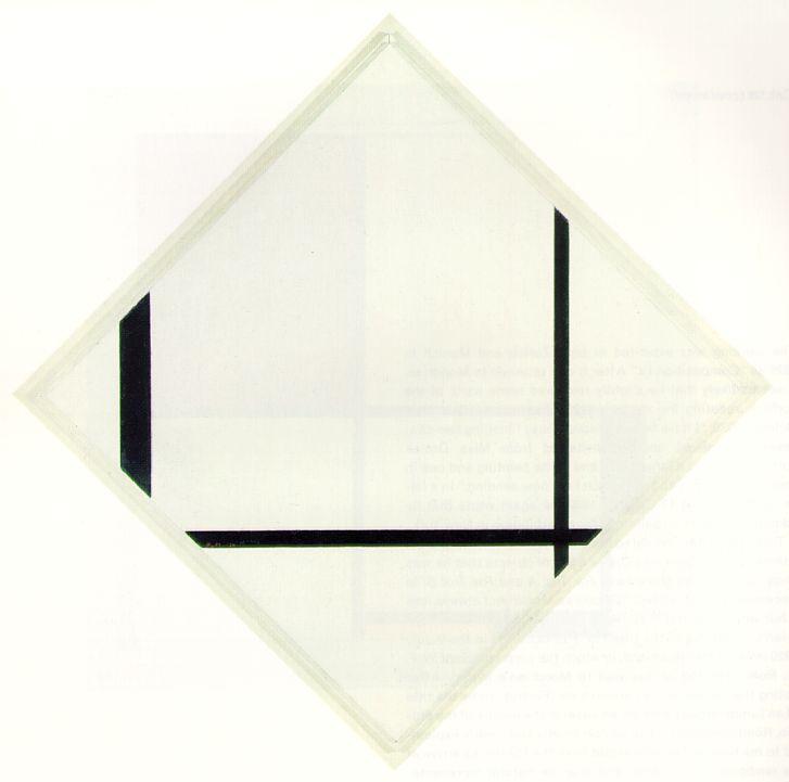
Broadway Boogie Woogie, by Piet Mondrian is a clear reference to music and dance. Mondrian was a keen ballroom dancer, and some of his works are named after dances, for example Fox-Trot B, and Fox-Trot-Lozenge-Composition-with-Three-Black-Lines.
I read in one place at least the implication that he was a good dancer, for example that he practised dance steps in his studio and was known as ‘The Dancing Madonna’ in Holland. Then in another place:
He went shopping for painter’s smocks with Naum Gabo’s wife Miriam and danced with Peggy Guggenheim and Virginia Pevsner in the London jazz clubs. His love of jazz and dancing was well known, but Miriam recalled that he “was a terrible dancer… Virginia hated it and I hated it, we had to take turns dancing with him”.
In an article entitled Dancing with Mondrian By Annette Chauncy, published by The International Journal of the Arts in Society, she suggests that the paintings were possibly inspired by the dances, especially the Foxtrot, the Quickstep and the Tango.
I also found this little film clip entitled Mondrian and Dance at the San Fransisco Museum of Modern Art, suggesting that the paintings ‘dance’ more than perhaps we thought.
