Make Colour Sing, Nottingham Pop Up Exhibition

Pop ups, by their nature last only a short time and this one finishes Sunday night, having been open almost all of this week, at Nottingham Society of Artists Gallery, Friar Lane, Nottingham. It’s a survey of contemporary abstraction curated by printmaker and painter Laine Tomkinson, who includes some wonderful prints of her own in the show, where colour-resonance is a major preoccupation.

Her screenprints sometimes resemble collages in their multi-layered-ness, some may even be collage, which could be a sub plot for her curation of this exhibition.
Collage artist EC has three works in this show. They are small and in one sense quite delicate, I get the impression that they could easily be damaged, yet the paint handling (these collages appear to be made of cut-up paintings) is so sturdy and confident, that the works also look robust.

John Stockton’s prints are photographed collages that lose their materiality in the transition from thing to image, whereas Martin Heron’s beautiful drawings appear to dematerialize as repeated lines of colour tail off in concert, creating gaps where the paper is left bare, perceived as positive shapes that glow. His ink on scrim pieces also dematerialize into shifting shades and hues of reflected light.

David Manley’s large vertical paintings on paper, play with both the physicality of paint, (we get drips and scribbles and mixed-on-paper areas of colour), and its image-making potential, (we find ‘primitive’ evocations of signs and symbols here and there). Paint is at one and the same time, physical stuff that can be pushed around canvas or paper and an immaterial vehicle for colour, and sometimes for associative content. (In my photo a bit of Nottingham architecture is also reflected in the glass.)

Neil Clements small paintings on card are direct presentations of colour-shapes, often two colours only, creating figure-ground shifts, my perception of them continuously alternating between positive and negative, impossible to fix on one view and have perceived the whole.

Richard Perry uses colour to describe the various planes of geometric shape in the small scale sculptures on view here, but colour behaving as it does, description gives way to dissolution, not of shape but of weight.

In works on view here it is the materiality of the support and the demateriality of the colour, as something that exists only in perception to which I keep on returning, as if colour could switch to auditory channel and sing.
Abstract art and photography
For me, the important link between abstract art and photography was established in those famous words of 19th century painter Paul Delaroche, uttered after seeing a daguerreotype for the first time: “from today painting is dead”, painting that is, as naturalistic representation.
So painting became increasingly abstract….and then so did photography, artists like Man Ray and Moholy Nagy exploring its potential as an abstract idiom, and since then…
I am looking forward to seeing this show at Tate Modern
Hue shift
A beautiful simple demonstration of the subjectivity of colour
Colour: A Kind of Bliss
Colour can be indulgent. You can lose yourself in it, as in colour field painting. Viewing a gigantic Jules Olitski for example, such as Instant Loveland, (1968), undoubtedly induces a blissful state. The critic Peter Fuller was wary of this experience. I remember being shocked, hearing him refer to this paintings as “awful”. Today, I still think it is a great painting. However, I can see that it may be in danger of eliciting a gormless fascination, a distraction from the “real world”, a bliss that smacks too much of escapism, an opiate.
When Roland Barthes refers to colour as “a kind of bliss”, [i] he is countering a first impression of Cy Twombly as an anti-colourist. To do so, Barthes differentiates colour “in the blissful sense of the word” from colour as a “rhetorical mode of existence”, a “sensual idea”. He contrast them along the following lines.
| Colour as bliss | Colour as sensual idea |
| Lacerates something, passes in front of the eye, apparition, disappearance, like a closing eyelid, a tiny fainting spell. Appears, is there, inscribed, | Intense, violent, rich. Delicate, refined, rare. Thick-spread, crusty, fluid. Affirmation or installation of colour |
For Barthes blissful colour is almost incidental, as if the altered state that colour induces were akin to the naturally occurring trance states that we experience on an everyday basis, a daydream, an apparition, or a negative hallucination such as not being able to find the car keys, even though they are staring you in the face on the kitchen table. Disappearance, a closing eyelid or a tiny fainting spell has momentarily hidden them.
Colour as bliss cuts into our everyday “reality”. It is inscribed into it, rather than installing itself with cries of affirmation. Yet, neither is it exquisite nor exclusive. Instead, it is simply present if we are. However, it is the presence of something quite extraordinary, as David Batchelor has it, “a falling into a state of grace”.[ii]

Julian Brown, Vega, 2016, acrylic on canvas, 50 x 40 cm. Image by courtesy of the artist
The 18th century poet Thomas Gray had already associated colour with bliss in his poem Ode on the Pleasure Arising from Vicissitude, where “the hues of bliss more brightly glow chastised by sabler tints of woe”. Colour, appearing brighter when countered by black, becomes in the poem, a metaphor for the tempering of joy with grief, again suggesting a grounded bliss, somewhere between hedonistic pleasure and spiritual ecstasy.
Kandinsky no doubt overstated the case for colour in his treatise Concerning the Spiritual in Art, invoking its healing power after the fashion of chromotherapy, but the attempt was to ground the spiritual in the discoveries of “science” at the same time as showing that colour could affect the viewer directly, quite apart from the requirements of imitation or analogy. He was making a case as much for abstract or non-objective painting as for colour.
The artists included in the exhibition Colour: A Kind of Bliss, at St Marylebone Crypt, London, approach colour directly, without the distractions of representation, but also without an over indulgent spirituality.
In the paintings here by Julian Brown, colour seems inherently tied to the ground upon which it is situated. In Vega (2016), spectrum bands zig zagging across the surface have been applied over a polished, pearl white surface that shines through the gestures lending them a vibrant luminosity. Scattered among the assertive bands of colour are black circles, dots that look to have been dropped or splattered into existence, except that they also look too carefully placed to have been made that way. A non-verbal conversation takes place between the ground, the rainbow bands and the black dots, as well as between each band, some favouring the yellows and oranges of the spectrum and others more the blues and violets, each band shot through with lines of other temperatures.

Julian Brown, Tattoo Lagoon, 2017, acrylic on linen, 80 x 100 cm. Image by courtesy of the artist
In Tattoo Lagoon, (2017), the sabler tints of dark blue and grey form circular patterns in the centre, flanked and partially obscured by multiple crescents of various colours, resembling melon boats on a sea that is just about to become stormy. They are accompanied by circles in gold, amber, maroon, black and silver along with tiny yellow speech balloons, ochre asterisks, pink drips and blue or green runs. And all the time it’s the dark ground that calls to us, almost menacingly. A captivating darkness is waiting to envelope us, just as it has already overtaken some of the crescent shapes, absorbing their colour into a homogenous mass of dark.
Yet it is a playful and joyous painting, the darkness recalling the dark ground of East Asian decorative lacquerware or indeed the Polish folk art that Brown cites as an influence.
In David Manley’s shield-like ovals painted on aluminium, colour differentiates one form from another, or merges geometric shapes so that they come in and out of view often giving way to a larger pattern of their interconnections, like cut-outs in paper, where the paper is kept and what’s cut out is thrown away, as if to bring our attention to the importance not so much of things as the relationships between things.

David Manley, Nine Lives Of Fives, 2017, acrylic on aluminum, 72 x 48 cm. Image by courtesy of the artist
In his Nine Lives of Fives, (2017), pentagon forms are all but destroyed by having been posited, erased and restated numerous times and in many places within the frame. Colour gives them life via demarcation, just as it does for map-makers who have known for centuries what I only just learned from Beau Lotto that “you only need four colours to create any map and be able to make sure no bordering countries are ever coloured the same”.[iii]
In my own paintings, I am interested in what 17th century cartographers knew about colour, that colour spreads, not “really” i.e. physically, but “really” i.e. in our perception. It is unnecessary to colour-in every country of a map, the colour of a bounded outline can be made to spread into an area, not physically, but perceptually. Visual cognition scientists have called this the watercolour effect (WCE). A light meter will show you that the area is physically white, but colour is perceived there as a result of the boundary colour. In my Cybernetic Drawing (Hexagons), (2014), the lilac of the drawn lines merges into the white of the ground in a similar way.

Andy Parkinson, Cybernetic Drawing, (Hexagons), 2014, mixed media on canvas.
In, Jeff Dellow’s paintings the same motifs change dramatically in different colour-environments. A motif seen in one painting looks very different when set within the differently coloured ground of another. Also, within a single painting, a repeated motif, especially the net-like motif that appears quite often, looks markedy different depending on its colour. But even more interesting, the ground that I know is the same colour over a large area, changes colour where different coloured nets interact with it. In Orange Fix, (2016), the orange ground between and around the squares of the green/grey net motif is much redder than it is between the squares of the lilac/greys along the right hand edge. The ground is the same colour physically but perceptually it changes. Although we “know” that such “illusions” will take place, when they do, they surprise us. I think that is what makes colour so blissfully enjoyable.

Jeff Dellow, Orange Fix, 2016, acrylic on canvas, 72 x 92 cm. Image by courtesy of the artist
The paintings of Freya Purdue are like colour landscapes, it is difficult not to read the blue grounds as skies, within which are colour happenings, resembling what daylight fireworks might look like, bursts of colour sometimes taking up discrete areas here and there and sometimes filling half the space.
Purdue’s Nada (2016), may be a picture of nothing. The sky association remains and there is a cloud-like shape, taking up more than half of the canvas. It could be a swarm of smaller nothings, insects perhaps, or atoms, or smoke. And this indistinct cloud hovers above sticks of colour that are arranged to suggest a perspectival recession into a vanishing point at the centre of a low horizon line. Associations abound, as they do whenever we see colours, but without ever cohering into a definitive object or idea or story. No thing is clearly depicted.

Freya Purdue, Nada, 2016, oil on canvas, 50 x 60 cm. Image by courtesy of the artist
Lucy Cox’s playful geometric arrangements, almost inhabiting a believable three dimensional space, seem to celebrate the ways in which colour creates spatial ambiguities and irregularities. In Zippy Seven, (2017), holes in grey planar structures reveal coloured and/or patterned surfaces way behind them. However, being more coloured than the sable structures, the parts of surfaces covered by holes appear to push forward, sometimes occupying the space immediately behind a hole, but more often transforming themselves into positive circles that hover in front of the grey planes.

Lucy Cox, Zippy Seven, 2017, acrylic on canvas, 50 x 50 cm. Image by courtesy of the artist
Knowing a bit of colour theory we could have predicted this chromatic (mis)behaviour. Nevertheless, when it happens we experience a jolt of surprise as if it had been totally unpredictable.
The trouble with colour theory is that it con’s us into thinking we understand colour. Yet face to face with it, we find that we cannot get wise to it, almost as if it puts us in the wrong and makes us ignorant. But isn’t ignorance also bliss? Borrowing even more famous lines from Thomas Gray: “Where ignorance is bliss, ‘Tis folly to be wise”.[iv]
Colour: A Kind of Bliss, curated by Lucy Cox and Freya Purdue continues at The Crypt, St Marylebone Church, London until 30 June 2017.
[i] Roland Barthes, The Responsibility of Forms, Basil Blackwell, 1986
[ii] David Batchelor, Chromophobia, Reaktion Books, 2000
[iii] Beau Lotto, Deviate, The Science of Seeing Differently, Weidenfeld & Nicholson, 2017
[iv] Thomas Gray, Ode on a Distant Prospect of Eton College, 1747
Nine Painters, Syson Gallery, Nottingham
I must have been nine or ten years old when my dad took me to the visitor centre at the yet-to-be-built nuclear power station at Heysham, Lancs, where artist impressions of the plant were accompanied by highly optimistic commentary related via head-phones. Many years later, in 1989, I saw the plant with my own eyes and it bore little resemblance to my memory of those artist’s impressions. There was a marked contrast between what was promised and what was delivered, certainly from an aesthetic point of view. There had also by now been a huge shift in public reception of nuclear power in general. After all, there had been the Chernobyl disaster and the Three Mile Island accident. Early optimism had turned into disappointment and foreboding. There was also the feeling that malevolent forces were at work (reinforced by the blatant lies that had been told about the economics of nuclear power around the time that Thatcher’s government privatised the industry). And maybe this narrative reflects another, the rise and demise of modernism.

Sean Cummins, Operator, 2016, acrylic on canvas, image by courtesy of the artist
Sean Cummins’s large painting Operator, (2016), here at Nine Painters, at Syson Gallery, Nottingham, recalls late modernist colour field abstraction and pop art, in this pared down representation of an operator in a nuclear power plant. However, this is not a portrait, the schematic representation of the face providing little by way of individual detail. And my interpretation of the sparse forms as the interior of the operations room of a power station arises as much from the title as from specific clues in the painting. Nevertheless, it does seem to posit both optimism, or rather a nostalgia for that optimism, and foreboding. Whilst the painting is all high coloured surface, there is also a sense of something awry beneath the surface.
I think something similar is happening in Steph Goodger’s wonderful paintings of coloured flashes on dark grounds that give way only gradually to figurative detail, and there is specific detail here, almost as if they could be portraits… of places. At first I find the attractiveness of the paint handling and the colour fascinating in themselves, seeing these as abstract paintings, until it dawns on me that these are night-time scenes of the makeshift homes of refugees in Calais.

Steph Goodger, The Twilight Kingdom III, 2017, oil on canvas. Image by courtesy of the artist
There are also paintings here by Goodger of boxcars. They are even more like portraits, I hear another viewer comment on imagining that all steam engines and carriages have faces and blaming it on Thomas the Tank Engine. At least I am not on my own. I hear someone else remark “oh a steam train, how nice!” I don’t know how long it takes for me to realise that boxcars have had a more sinister use than for freight transport. The Nazis used them to transport prisoners to the concentration camps, and it occurs to me that these paintings allude to this something awry beneath the surface. The observed details are very specific to each “portrait” but the suggestions of human cargoes are general, creating a vague sense of unease.
There are undercurrents in the minimal figuration of Michael Simpson. A tiny painting, entitled Squint, (2016-17), is cleverly situated very high on the wall in the main gallery, and could have been cut out of his large painting that won the John Moores prize last year. In that painting a step ladder is pictured beneath a leper squint. In medieval times a squint was a small opening in the wall of a church that provided people with leprosy a way of peering in to see and hear the sermon without touching any of the congregation. Here at Syson gallery we are in want of a ladder. One of the judges of the 2016 John Moores Painting Prize, the artist Ansel Krut, speaking of the winning painting said that the artist “uses an almost minimal vocabulary to open up a world of great sympathetic imagination” and that the painting “touches on the nature of silence, on distance and on exclusion. But most importantly, it touches on the privileges of looking.” The same could be said of the tiny Squint painting on display here, and also of the equally tiny paintings of single cupboards or safes (?) with their doors open.

Installation snapshot of Michael Simpson, Squint, 2016-17, oil on canvas, my photo
Another of the John Moores judges, Richard Davey, is the curator of Nine Painters, here bringing together a rather disparate group of painters from within the UK, associated with either the John Moores prize or the Royal Academy. I asked him “why these nine?” his answer was close to “why not?”
Other figurative painters here include Gabriella Boyd whose colourful works on paper may also appear at first-sight to be abstract celebrations of colour and pattern and only on further viewing do erotic undercurrents seem suggested. (I worry slightly when I say this, in case it’s just me.)
Richard Kenton Webb also approaches abstraction, in that figurative motifs resembling parts of musical instruments, in greens, yellows and blues, rendered with a chalky, high-pigment oil paint made by the artist, float in a shallow, almost non-figurative space (there are clouds and a hill). Five big paintings in horizontal, almost panoramic format, are stacked one above another creating a wall of alluring colour. The set is entitled The Five Senses, (2015-17), each painting named individually, Smell, Taste, Touch, Sound and Sight, in keeping with Webb’s interest in synaesthesia. The paintings are impossible to photograph, and absolutely have to be seen for real in an exhibition space, highlighting the artist’s insistence that digital viewing has become a commonplace, against which, going to a gallery and looking at physical works has become more interesting. The digital represents our boring experience of the everyday, which is contradicted by the committed observation that painting engenders and that evokes all the senses at once.
Stephen Chambers’ The Perfect Nude 1, (2010), is clearly a figurative painting but his command of colour makes a formalist reading of his work at least tempting. A temptation to which the curator has almost succumbed by placing it next to an abstract painting Eleventh Hour Squared 3, by Selma Parlour. Both artists make extensive use of cadmium yellow, for Chambers it is the floor upon which the nude rests, for Parlour it is more ambiguous. It could describe a section of wall above what could be read as a window, or rather the top left corner of a window, or maybe instead, a quadrant of a pyramid in bird’s eye view. Alternatively, it’s a yellow truncated triangle in an arrangement of coloured geometric or architectural shapes on a flat surface.

Selma Parlour, Eleventh Hour Squared 3, 2016, oil on linen. Image by courtesy of the artist
Reading Eleventh Hour Squared 3, (2016), as a flat surface becomes more difficult the more that shadows are perceived and the more the luminous blue square is perceived as sky through a window pane flanked by a brown frame, the primary image that I keep settling upon, until the pyramid reasserts itself. But then I am puzzled by the sense of this being a corner or a quadrant. In what context might one see only this part of either a pyramid or a window? Photography comes to mind, the camera frame characteristically cropping objects in this way. And there is something about the colour quality, thinly applied hues, with the white surface behind giving them brilliance, which is reminiscent of a photograph or a computer screen. The paint application, transparent films of oil paint, with no visible traces of the artist’s toil, also lends itself to this interpretation. If photography is “drawing with light”, then Parlour’s paintings are closely akin to photography. However, they are ultimately abstract because figurative interpretations, like the ones suggested above never quite work enough to arrive at definite conclusions. What might have been perceived as a window frame probably works best if seen as a picture of a painting, this one.
Similarly in Cloud II, (2017), although there is more of a depicted space, a kind of stage within which objects are situated, the objects are like paintings within a painting. In Parlour’s work it is as if the hint at referential content is always self-referential, always bringing us back to the painting itself.

Selma Parlour, Cloud II, 2017, oil on linen, image by courtesy of the artist
There may also be references to the history of abstraction, specifically post-painterly abstraction, or colour field painting, if not in the scale of the works, then in the artist’s choice of technique, in which the method of production is hidden by the method of production itself, the labour painted out or sublimated.
The paintings here by Eleanor Bartlett, on the other hand, wear their labour on their sleeves. Here we get much more painterly abstraction in robust materials like tar and metal paint on canvas that also looks heavy-duty. Their physicality is underscored by the repudiation of colour other than the natural hues and tones of the materials. Yet the small pieces Untitled #35 and #36, (2016), have a contradictory delicate quality, as if the loose geometric forms, rough squares or rectangles cut off along one edge, resembling pits in the ground, have transformed alchemically into precious metals.

Eleanor Bartlett, Untitled #35 and #36, 2015, tar and metal paint on canvas. Image by courtesy of the artist
These two paintings are positioned right next to the tiny diptych by Michael Simpson of open-doored cupboards or safes, bringing to attention the formal similarities of the two pairs of paintings, even though they arise from quite different traditions and concerns. Curator Richard Davey seems fond of doing this, also placing larger paintings by Bartlett so they flank one of Goodger’s boxcars. Again, formal resonances between otherwise very different works are made apparent.

installation snapshot, Untitled paintings by Eleanor Bartlett, tar and metal paint on canvas, 2015, either side of Steph Goodger, Boxcar II, 2014, oil on canvas, my photo
If in Bartlett’s paintings base materials may sometimes appear to transform into precious metals it is in no way because the materials have to become form in order to achieve this. No, these paintings are physical presentations of the material displayed for its own sake. If they become something else they always do so whilst also staying resolutely material.
In Mali Morris‘s abstract paintings, although there is clear enjoyment of the materiality of the paint, it’s de-materialisation into colour and light is more important. And if the physical stuff of paint is transmuted into light, the artist’s toil is transformed into play. The paintings are joyous, fun even, but in the same way that in dance, much effort is expended in making it look easy.

Mali Morris, Together, 2011, acrylic on canvas, image by courtesy of the artist
In Together (2011), a central cruciform shape is suggested by placing rectangles of differing colours in the four corners of the canvas, over a gestural ground in magenta that also seems to float above other grounds or layers of colour, some darker and some lighter than itself. The four rectangles are flatly painted but semi-transparent. There is no doubt that they are resting upon the magenta, having been painted after it was set down. However, because they are painted in different colours they appear to occupy different planes, no longer simply floating above a ground that also appears to float, they enliven the whole space in a complex way that is difficult to describe in words. It is easier to point to it and say “this rectangle seems to occupy a space in front of this one”. The sensation of luminous colours creates a strange two-dimensional space that is anything but flat.
The artist Terry Greene recently brought my attention to a quote by Helen Frankenthaler where she says “it is light that counts above everything. Not coloured light, but colour that gives off light – radiance” and this seems highly applicable to the paintings of Mali Morris.

Mali Morris, Long Crossing (Six/Sixteen), 2012-15. Acrylic on canvas. Image by courtesy of the artist
On the opposite wall, another painting here by Morris is Long Crossing (Six/Sixteen) (2012-2015), in which a loose zig-zagging line in maroon or alizarin crimson tacks horizontally over a scumbled ground of reds, oranges and pinks and in front of it, a further line, in yellow, zig-zags a vertical pathway ending with a left-pointing arrow head. I think I know which elements came first and last, and whilst I don’t really know this, my imagined sequencing of the gestures is based on visual evidence. The yellow line/marks, like the rectangles in Together, are clearly the top layer, the rest of the action taking place behind them. But colour doesn’t behave itself. Visual space and time can disagree and colour gestures that took place earlier can project forward as if they had been made later. The ground upon which actions are based can push forward for re-examination like the surfacing of long forgotten presuppositions. Time is required for events that were background to foreground themselves and return, and for certain colours or gestures to cluster together to form temporary figures like the central S shape that forms a figure of its own only until it gives way to other gestalts. These spatial shifts and temporary alliances of parts, that never compete with the whole, cannot be perceived simultaneously even though they are always already there, and even when I have viewed the painting for a very long time new gestalts can still surprise me. I am reminded of that wonderful line in that poem by John Donne where, punning on his own name, he says “when thou hast done, thou hast not done, for I have more”. In Morris’s work I continually have this sense that there is always more, that done deals are never once and for all, that decisions are continual “decidings”, not nouns but verbs, as if our future is not necessarily closed and could yet be re-imagined, which leaves me with a certain optimism, even if only for the duration of my visit.
Nine Painters, curated by Richard Davey, continues at Syson Gallery until 6 May
It includes paintings by: Eleanor Bartlett, Gabriella Boyd, Stephen Chambers, Sean Cummins, Steph Goodger, Richard Kenton Webb, Mali Morris, Selma Parlour, and Michael Simpson
Colour: A Kind of Bliss, St Marylebone Crypt
I am delighted to have been included in the group exhibition curated by Lucy Cox and Freya Purdue, Colour: A Kind of Bliss, at St Marylebone Crypt from 5 April to 30 June 2017.
Julian Brown, Tattoo Lagoon, 2017, acrylic on linen, 80x100cm
From the Catalogue Introduction, written by Lucy Cox and Freya Purdue…
“Colour is a kind of bliss … like a closing eyelid … a tiny fainting spell.”
– Roland Barthes
Colour: A Kind of Bliss brings together six British painters concerned with different approaches to the use of intense energy and luminous qualities of colour. Through varying densities of paint and chroma, saturation and de-saturation, their paintings realise direct emotive forms resulting in both subtly and vibrancy. Painting for these artists working in the field of abstraction/non-figuration is a synthesis of ideas, drawing and colour.
In the vast expanding digital world, we have become entranced by momentary glimpses of virtual light and colour, unable to arrest or capture fast moving, subliminal and evanescent experiences. This relationship has become a new condition for the human spirit, perhaps a kind of bliss in its own right, somewhat disconnected from nature. The screen distraction separates us from the power of colour in the natural world and our instinctive awareness and sensibilities of perception; encountering fleeting images of light is not the same as experiencing the contemplation of colour in the physical world. This polarity is conveyed in a number of ways.
Some artists express the meeting and departure between virtual and physical spaces, and the playful possibilities of optical illusion; others retreat into memories, music or philosophical and mystical thought, occasionally slipping back into physicality and the processes of seeing and understanding. All of these concerns embody colour as a kind of bliss, a never-ending kaleidoscope for both the painter and the viewer.
Artists: Julian Brown, Lucy Cox, Jeff Dellow, David Manley, Andy Parkinson and Freya Purdue.
|
|
Trevor Sutton, Assembly and Image, at Class Room, Coventry
It’s not the kind of work I might usually associate with Trevor Sutton, having become more familiar with his paintings on dual or grouped canvases in the seventies and his recent paintings on board, often including paper, which could possibly be thought of as collaged elements. And this might be the link to the works here. They are assemblages, but of deliberately manufactured, rather than found parts, in painted plywood. They have all of Sutton’s hallmark precision, I can hear people asking “how did he get those shapes and edges so precise?” Indeed, especially considering that these were made in 1981/2, before laser cutting was in general usage. But they also have a quirky informality, which I think is less characteristic of Suttons oeuvre.

Trevor Sutton, Michael, 1981, Acrylic on Wood, image by courtesy of the artist
The space here at Class Room, is informal and small. The works on view are sharp, and about the size of a human head, inviting portrait associations. These were Sutton’s first works on plywood, and some were exhibited in New Works of Contemporary Art and Music at the Fruitmarket Gallery in Edinburgh and Assembly & Image Paintings at the Lisson Gallery in London, both in 1981. The artist said he wanted to make something that seemed sharper, more immediate, whilst also being intimate as if looking into a mirror, and that’s the feeling I get as I look at them here, my instinct is to get close and peer into them, whilst knowing that the action takes place at the surface, not really inside, as in a picture of something else.

Installation view, Left, Michael, 1981; Right, Walking the Dog, 1982. Image by courtesy of Matthew Macaulay
Reading the gallery notes I learn that Sutton sent diagrams and drawings to the artist George Meyrick who cut the plywood into shapes for him. Sutton painted each plywood piece separately. When it came to assembly he playfully reconfigured the pieces rather than simply assembling them as in the working drawings. The perfect marriage of precision and immediacy is a direct result of the process.
As in earlier works drawing is achieved via construction, lines are real, the edges of joined or overlapping parts but the plywood gives the “drawing” more precision, more clarity when compared with lines created in earlier paintings by joining or grouping canvases, which are inherently softer. Somehow the unmodulated painted surfaces also look crisper when the paint is applied to plywood rather than canvas. Whilst the free-form shapes didn’t continue into later work the plywood, with the increase in sharpness it provided, did. So perhaps these assemblages could be seen as a bridge between Sutton’s earlier and later work.

Trevor Sutton, Tight Tumble Tern, 1982, Acrylic on Wood, image by courtesy of the artist
Am I wrong to find some similarity to the wood reliefs of Jean (Hans) Arp? Colours in both have a low key quality, blues and greys with highlights in warmer or brighter hues. In both we get concrete forms creating an abstract figuration. Coloured shapes (geometric with Sutton and biomorphic with Arp) in wood, appear to have organised themselves into a coherent arrangement, with subtle spatial ambiguities (e.g. the bright blue square in Sutton’s Tight Tumble Tern recedes slightly in relation to the grey, yet is clearly in front of the grey physically) and referential associations. Sutton’s titles (though not Arp’s) seem to encourage associational content. However, I want to be clear that this is not the same as representation. That one thing calls to mind another is part of our experience of seeing, and arguably, this is even more present in abstract works than representational ones. What I think is presented here is that process of seeing, the double movement of observing and sense-making.

Installation view, Trevor Sutton, Beverley’s Little Car, 1982, Acrylic on Wood. Image by courtesy of Matthew Macaulay.
There’s no way of getting to “Beverley’s Little Car” from looking at the painted relief of that title, and any connection in the artist’s mind seems entirely idiosyncratic, but cartoon-like associations do come to mind for me and those circular shapes could easily suggest wheels. Even then, the artist probably had something quite different in mind. In my view, abstract artworks are better titled than simply numbered or left “untitled” if only to make them easy to distinguish and to recognise, like people’s names. These paintings have been likened to portraits, but if there is a connection it is not in their resemblances, but rather in the kind of close viewing that is elicited.
Trevor Sutton, Assembly and Image, is at Class Room until 6 April 2017, Tuesday and Saturday 11-5pm
HOW MANY ABSTRACT PAINTINGS DO WE NEED TO SEE IN THE WORLD, REALLY?
Interesting review by Geoff Hands. The show finishes 2 April (sadly, no chance I can get there).
Ruminations: Exhibition Reviews
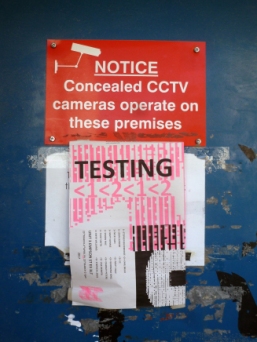
TESTING 1,2,1,2 UNIT 3 – A.S.C. Studios
(25 March – 2 April, 2017)
The argument over Abstraction in art (especially painting) still drags on. In Elephant magazine, issue 29 (Winter 2016/17), the prestigious American painter Kerry James Marshall makes some interesting, if debateable, comments on “Abstract picture making” as little more than an “academic mode”. He claims that “The fundamental principle of art making is representation… There are quite enough problems to solve to keep you going for sometime. If you never succeed there, and you go to abstraction because it seems easier, you miss the philosophical and aesthetic questions involved. Besides, how many more abstract pictures do we need to see in the world, really?”
Though tempting, it would be too easy, and crass, to say that there are also too many figurative paintings in the world. There are probably far too many bad paintings of any classification. But…
View original post 1,278 more words
The Order of Things at The Wilson, Cheltenham
The wonderful exhibition The Order of Things, curated by Andrew Bick, Jonathan Parsons and Katie Pratt, ended last week at The Wilson. It included work by thirteen international contemporary artists: Rana Begum, Andrew Bick, Guy Bigland, Edith Dekynd, A K Dolven, Adam Gillam, Daniel Robert Hunziker, Maria Lalic, Jonathan Parsons, Katie Pratt, John Wood & Paul Harrison and Neil Zakiewicz.
Catch my Review of it at Saturation Point Website

Katie Pratt, Poole, 2000- 2016, oil on linen, Image by courtesy of the artist
