Posts Tagged ‘David Manley’
The Discipline of Painting
“Before there was art, there was painting”, so says Barry Schwabsky in his essay Everyday Painting in the introduction to Vitamin P2. In the earlier book Vitamin P he explored the relationship between painting as art and painting as an art, a specific discipline. Throughout its history painters have questioned, explored and challenged the boundaries of that discipline. So much so that its definition has become somewhat unstable, to the extent that it might be better to think of it as an ‘indiscipline’ as Daniel Sturgis et al did in the exhibition The Indiscipline of Painting, that opened at Tate St Ives in October 2011 and toured to Mead Gallery, Warwick Arts Centre in January 2012, presenting a “partial and partisan” survey of abstract painting from the 60’s until now.
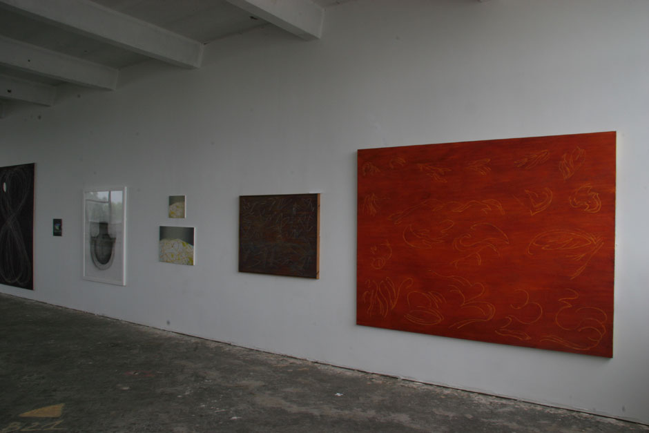
David Manley makes a tongue in cheek reference to that show entitling the new exhibition at Harrington Mill Studios The Discipline of Painting, featuring a ‘control group’ of works: one by Manley from 1973 along with two owned by him, a Sean Scully painting on paper from 1980 and a recent drawing on paper by David Tremlett, alongside paintings by David Ainley, Katrina Blannin, Luke Frost, Lauri Hopkins, Dan Roach, Andy Parkinson, and Trevor Sutton.

It used to be common to divide the discipline of painting into sub-categories or genres, still life, landscape, history painting etc, and whereas there was a time when abstraction looked like it might transcend all those genres it now appears to have become a genre, or tradition, of its own. That tradition could itself be divided into two approaches one that looks “disciplined”, we might even say “austere”, as opposed to a looser more casualist approach, where “spontaneity” and “improvisation” are the watch words. According to the gallery notes, “The selection of works on display shows an abiding and durable commitment to a disciplined abstraction that foregrounds an aspect of colour and form and a certain ‘discipline’ in construction”. (A second exhibition will explore the other approach.)
Luke Frost’s paintings have been described as “austerely reductive, minimal and hard edged” whilst also being “curiously alluring”. For me there’s something paradoxical about them, that such asceticism can at the same time be so wantonly pleasurable, that pared-down emptiness can give rise to such rich fullness. Deep Brilliant Blue Volts and Tangerine Volts are highly coloured square monochrome canvases with a fine line frame, painted in a colour the complementary of the ground. This subtle intervention elicits heightened visual excitation. The space is transformed by the frame in much the same way as, in language, meaning is transformed by context or ones “frame of reference”. The colour within the frame is ‘objectively’ the same as the colour around the frame, yet I experience it as a different colour. The edge and the central colour occupies literally the same space or plane yet subjectively the outer edge is spatially nearer than the middle. It’s like looking through a window onto an infinite field of colour. Then, as I turn away fractionally the painting seems to shift, or shudder optically, as if calling my attention back to it. It doesn’t want to let me go, and I don’t want to stop looking at it. We are locked into an exchange, a deeply contemplative conversation. Yet there’s no pseudo-spirituality in this experience, reminded as I am of the artificiality of the colours, and the matter of fact-ness of their presentation, something along the lines of Frank Stella’s famous “what you see is what you see”. However, seeing is a truly remarkable experience always involving more than the strictly visual.

Katrina Blannin’s paintings are similarly more-than factual. The three on show here are ‘the same’ in size and in design, but look very different because of the differences in colour. I have the sense of holding the whole thing constant and changing just one thing, and everything changes, recalling how in any system a change to a part always has consequences for the whole. Tracking such changes requires a serial approach, so it is particularly helpful to get three in a row here. Two are darker paintings, in indefinable blue/black/green/greys, applied in glazes (hence the difficulty of identifying specific names for the colours), with highlights in yellows, and one is in greys much nearer to white with warmer hues, creating an experience quite different to the other two. In fact so different that I have to be reminded that the design employed is ‘the same’ as in the other two paintings. Manley has positioned the two darker paintings slightly closer to each other than to the third one, a strategy that seems to heighten the contrast, whilst also allowing the two darker works to be read as a pair, hinting at relationships between the two that Blannin sometimes makes explicit in her own diptychs. The diagonal arrangement of tones and colour sets up a subjective experience of shifting planes, never just “this” or just “that” but sometimes “this” and sometimes “that”, an experience that is fundamentally time dependant.
Trevor Sutton’s beautiful paintings here are separated in time by twenty years, Rue Jacob, a circular painting with a central two tone irregular hexad shape situated within a field of fluctuating brown/grey hues, being painted in 1992, and Raindance, a vertical rectangular grid with four columns and sixteen rows in reds, pinks, greys, browns and blacks, having been painted only last year. They testify to this artist’s disciplined commitment to the idea of abstraction and to its ongoing exploration. Remembering that I saw a remarkable painting by Sutton in a show last year, Abstract Painting in the Seventies, higher in colour than these at HMS, I make comparisons in my head and note the “continued vigour” of his oeuvre (borrowing a phrase from Manley).

At the other end of the scale as far as years of experience goes, Lauri Hopkins a recent graduate, shows the continued relevance of the tradition for younger artists. Her wonderful constructions made from combinations of different coloured book covers recall Albers and Rothko, in miniature. Strictly speaking they are collages, but they read like paintings.
Once again I am impressed by Dan Roach’s paintings. The two here are quite different, in scale and colour, yet similar in that they employ his now customary arrangements of semi-transparent cell-like structures, situated in an indefinite space. That it is now possible to present abstract paintings on an almost miniature scale seems to me to be something new in the tradition, and Roach’s paintings have contributed to this development.

Dan Roach, Falling Up the West, 2012, Oil and Wax on Oak, 14.5cm x 19.5cm. Image by Courtesy of HMS
The paintings by David Ainley are colour monochromes built up in layers of thick paint, forming a substantial surface into which Ainley scores lines, revealing parts of the underpainting, in a process that is similar to excavation or mining. I am interested in the systematicity of the process as well as in the resultant ‘image’, each one a subtly interrupted surface, eliciting a state-altering meditative response. I choose to prolong the experience of viewing. There’s opticality here that, for me, is always more than the “purely optical”, including a sensing of time, suspended, distorted, and also simply passing, and with it a metaphorical connection to ideas related to mining, and toil.

I am pleased to have one of my own paintings hung alongside Ainley’s works. I think there are some resonances, in the final look, an interrupted surface that I hope engages the eye/brain, and in the process, almost in reverse. In my painting Screen (Yellow Band) it is more the process of covering than excavating that interests me. Layers of colour are hidden or covered, without being entirely obliterated. A black and white diagonal chequer pattern inadequately hides what’s underneath, forcing colour to the edges of each individual rhombus shape, and in this painting also to the right hand edge of the support, where a yellow vertical band is allowed to remain.
The Discipline of Painting is on show at Harrington Mill Studios until 27 October with a viewing on Saturday 26 October, 2-5PM. The HMS Open Studios also takes place Saturday 26 October 2-5PM and Sunday 27 October, 11-4PM
Installation shots by courtesy of David Manley
Coming Soon to HMS
The Discipline of Painting, curated by David Manley, 6 Oct to to 27 Oct, with View on Saturday 26 Oct, 2PM to 5PM, at Harrington Mill Studios, Long Eaton.

David Manley, Deadly Delicious at Tarpey Gallery
At Tarpey Gallery, David Manley‘s new paintings on circular (sometimes oval) aluminium supports have a wonderful, shiny gold- leaf quality, a consequence partly of the support and partly of the method of painting in semi transparent layers of different colours. They remind me of icons, but bigger, and it’s diseases they represent not divinities, if indeed they are representations. After all, the sensuality of the paint and luminosity of colour seem to be enjoyed in their own right, and I cannot easily verify their likeness to the specific viruses of their titles, because not being an epidemiologist I don’t often look at viruses through a microscope. So, I have little choice anyway, but to respond to each image on its own terms.
If I had not seen the title Smallpox nor made the connection to the deadliness of the Deadly Delicious series, it might have been only the deliciousness of this painting I paid attention to, with the informal handling of paint, but then also the careful building up of layers creating this hard, pearlescent surface. And there’s the vibrancy of the colours and the figural similarity to a bunch of grapes. It’s only as I look at the picture with “deadly” in mind that I start to wonder if the colours might be slightly too much, about to tip over into the fluorescence I might associate with dead things or deadly materials, the green of acid perhaps. It’s a feast of contradictions, seeming to celebrate the state of being “in-between”.

David Manley, DDA 1 – Smallpox. Acrylic on Aluminium, 90cm d. Image by courtesy of the artist
Manley is interested in viruses “because they inhabit a place somewhere between living and ‘dead’ or dormant things”, almost as if they are analogous with the situation of the paintings as somewhere between abstract and representational. The circular shape is “in between” landscape and portrait, or perhaps neither landscape nor portrait, though the miniature portraiture tradition might provide a precedent for reading them as portraits. However, in contradistinction to miniature portraits, in Manley’s deadly delicious series each image gives the impression that it could be turned through 360 degrees and continue to work. This impression is, I think, reinforced by the horizontal ‘flatbed’ orientation of a virus seen through a microscope, the circular supports of the paintings already having supplied the cue to interpret them as petri dishes or lenses.

David Manley, DDA 5 – Swine Flu. Acrylic on Aluminium, 90 cm d. Image by courtesy of the artist
DDA 5 Swine Flu is a diabolical image of coals in an eternal fire. It looks like what I imagine Swine Flu might feel like, not something I want to test! Just as I wouldn’t want to think of this image as a “point of contact” with the represented, as one might have done with a Byzantine icon. Nevertheless, icons were images of the invisible and surely this painting is also an image of something that is invisible, at least to the naked eye. Except, strictly speaking, the source material for each paintings is already an image, a picture of a microscopic event, which is then flattened out and simplified, or ‘abstracted’ but not beyond recognition for a scientist familiar with the given virus. The colours however, are entirely the artist’s invention. One type of electron microscope operates only in black and white, Manley explains, adding that because the conventions around coloration remain somewhat open ended “I took a decision right from the start that in this respect I had ‘carte blanche’ and have operated accordingly”.

David Manley, DDA 6 Sin Nombre , Acrylic on Aluminium, 90 cm. d. Image by courtesy of the artist
In DDA 6 Sin Nombre, the colours are rich blues, reds, ochres, and copper, their crisp edges contrasting with diffused colours in the blue ground, some of which may have been spray painted. And the ‘character’ of this painting (perhaps they are portraits after all) is quite different to The others. This one is calmer, cooler, less frantic than DDA 5 Swine Flu and softer than DDA 8 Measles.
I am interested in the fact that the source images are available to the artist only as a result of technology, and in the implied conflation here of art and technology. The words ‘art’ (‘techne’) and ‘technology’ share the same etymological root, surely. Yet the painterly style suggests ‘free play’, which may be akin to a more primitive approach, often in our thinking the opposite of the technological. In this respect I am reminded of the recent article in the White Review, Techno-Primitivism by Vanessa Hodgkinson and David Trotter, discussing a primitivism mediated by technology in the abstract paintings of Vanessa Hodgkinson and the writing of D H Lawrence.

DDA 8 – Measles . Acrylic on Aluminium, 49 cm. d. Image by courtesy of the artist
It may be the case that in a technological society an artist cannot not respond to technology in some way, even if that response is an unconscious one. David Manley is very conscious of the interplay between technology and the handmade that these paintings celebrate. Jacques Ellul argued that modern art is an imitation of technology or a compensation for it. The deadly delicious series seems to have elements of both.
David Manley, Deadly Delicious, is showing at Tarpey Gallery until 31 August
Paintings by Susan Disley at HMS
My ongoing quest to see abstract paintings north of London brings me today to Harrington Mill Studios in Long Eaton, where there are paintings by Susan Disley. There are also works by Rosie Kearton: photograms, etchings, collagraphs, related to walking in the landscape, very enjoyable, just that it’s the painting I have specifically come here to see.

Like Kearton’s prints, Disley’s paintings are related to landscape, abstract landscapes perhaps, some more clearly connected to their starting point than others. It’s the ones that are the most ‘abstracted’ that interest me the most, pared down to almost no-thing, as if in a search for ultimate form.
Susan Disley is better known for her ceramics, and even if I had not known this I think I would still find something vessel-like in the forms she arrives at. Mr Blue Sky, shown in the installation shot above, has just three parts, a widened out, light blue “U” shape at bottom that is virtually impossible not to perceive as sea, but could also be read as a cup or similar container, cradling an earth-space that takes up most of the one meter square canvas, and a dark blue line at top that is probably the blue sky of the title. However, this blue strip is darker and heavier than sky. I find it slightly disconcerting. Surely, in the normal scheme of things, light is up whereas dark/heavy is down. Here it is the other way around. The hint of threat contained in this inversion seems to create an element of seriousness without quite becoming angst. It’s abstract impressionism this, rather than expressionism (acknowledgements to Zak Braiterman for a novel application of this distinction). For the most part it is warmth and joy that the painting communicates, something like that feeling of well-being that comes over me on a hot sunny day. The central part of the painting, a muted earth colour, seems to reflect not just light but warmth back at the viewer.
Where the earth and light blue areas meet they form an indecisive edge, as if we can’t be sure where one ends and the other begins. In nature, boundary lines are fuzzy, but we go ahead and assign them anyway. According to George Lackoff and Mark Johnson, “When things are not clearly discrete or bounded, we still categorize them as such, e.g. mountains, street corners,hedges etc. Such ways of viewing physical phenomena are needed to satisfy certain purposes that we have: locating mountains, meeting on street corners,trimming hedges. Human purposes typically require us to impose artificial boundaries that make physical phenomena discrete…”

Susan Disley, Enclosure I, Enclosure II, oil on board, each is 35cm x 35 cm. Image by courtesy of the artist and HMS
The boundaries in Enclosure I and Enclosure II, are more distinct than in Mr Blue Sky, the paintings appearing to be about the very act of demarcation. Contemplating these abstract images I am impressed by the beauty of the resultant forms and at the same time reminded of the political implications of land enclosure. Imposing artificial boundaries helps us to understand the world around us, and is also a means of exercising power. The birds eye view emphasises this for me, picture making here becoming similar to map making, again a means both of understanding and control.

Sue Disley, Landscape in Pink, 2013, oil on board, 1m x1m, image by courtesy of the artist and HMS
We’re back to fuzzy boundaries in Landscape in Pink, and the interpretive cues are almost so generalised as to lose the landscape association, except that it is virtually impossible to lose, as if we carry it with us in our bodies. Even if there was no intentional link to landscape we would probably find ourselves making the connection anyway. We refer to the very orientation of the support as either “portrait” or “landscape”, hence artists such as Kazimir Malevich and Ad Reinhardt favoured the square format, incidentally Disley’s favoured format also, as if unconsciously she wanted to make the viewing of them as landscapes problematic.
As in Mr Blue Sky there are three areas: an “above”, a “below” and a large expanse between them, this time in warm pink, with other colours pushing through a scumbled light ground. Almost the opposite of the other painting: there’s a heavy dark grey below and light blue above, but if they relate to sea and sky or earth and sky I find it fairly difficult to read that way. More than anything else I think it’s a painting of space. It reminds me of a habit I like to indulge in of gazing into the mid distance. Someone usually asks what I’m staring at and I try to mark out the area of space in three dimensions with my hands: “that’s ridiculous you can’t be staring at that, there’s nothing there”. And it’s something similar that I think is going on here, as if the attempt is being made not so much to paint an area of earth as to paint the space above the area of earth, the space in the mid distance that has nothing in it. Or is it rather that viewing the painting triggers that experience? Because here I am staring and slowly becoming aware of the space between me and the painting. I get nearer so that I can see the brush strokes and the way the surface is constructed, inspecting the canvas edges where the colours underneath the unifying ground are more easily identified, and so it is the painting I am seeing rather than the space between us. Then, as I step back to make sense of the whole it’s that mid space again. The painting wants to be stared at in this way! And it dawns on me that it’s boundaries I am thinking about again, the boundaries within the painting, then the boundary between the painting and it’s environment, between the painting and me, and that is a very fuzzy boundary indeed. I find that I can identify with the painting and also dis-identify, I can be “in it” and “outside it” just by shifting my awareness subtly, in a similar way to the shifting between figure and ground that is part of what happens in these pictures. The painting is a container, but what it contains extends beyond its own boundaries, limited not so much by the edges of the canvas as by my own visual field.
Talking with David Manley, the curator of this exhibition, we note some of Disley’s influences, there’s something of William Scott in here, especially in the drawing, and I wonder if Agnes Martin’s use of muted colour might also be an influence. I think that Scott’s paintings seem to be much more about tone and Martin’s much more about hue and I attempt to characterise Disley’s paintings using the same categories, but come to no conclusion. I do find that I am influenced by them, as getting back to the studio I realise that I have filtered out the high colour in the painting I am currently working on.
Susan Disley – Rosie Kearton is showing at Harrington Mill Studios until 31 July, viewing by appointment email or tel: 07891 262 202
(The Lackoff and Johnson quote is from George Lackoff and Mark Johnson, Metaphors We Live By, 1980, University of Chicago Press)
Dan Roach etc.
I wish I had seen the Dan Roach exhibition at Harrington Mill Studios in 2010, having recently viewed a magnificent painting by him at the Double Vision show at the Lion and Lamb Gallery…

…beautifully painted, the way that various layers show through carefully rendered transparent shapes, themselves forming a rhythm that echoes the central figure, and contrasting with other shapes that are also made by revealing underpainted areas but this time as if clearing away the top layer to allow a gestural mark to come right up to the surface.
I am glad that David Manley recently brought my attention to another opportunity to see work by Dan Roach at the upcoming Plane Space exhibition in Worcester Cathedral from 8 to 15 September.
It also includes, Katrina Blannin and Sarah McNulty (they also showed work at Double Vision) as well as Paul Rosenbloom, Gwennan Thomas and Karl Bielik. Thinking of Bielik there’s this good write-up of a studio visit by Paul Bhenke at Structure and Imagery.
Pop up at the old lock up
The artists exhibiting at the pop-up exhibition Salon 1, the Summer Exhibition of Contemporary Art at the Old Lock Up Studio in Cromford on the 18th August 2012 are: Diane Atherton, Jackie Berridge, Clay Smith, Nick Hersey, Ivan Smith, Anthony Hall, Rachael Pinks, Jen Aitken, Filomena Rodriguez, Amanda Collis, Kim Sharratt, Vitor Azevedo, Nicola Eleanor Waite, Gareth Buxton, David Manley, Andy Parkinson, Justine Nettleton, Deb Allit and Dermot Punnett.
")
Having a quick look at the web sites has got me in the mood for seeing interesting work of many different types, whether abstract paintings by David Manley, narrative paintings by Jackie Berridge, photomontage of Clay Smith (by the way, am I the only one making a distinction these days between montage and collage, and have I even got it right?) abstract landscape collage paintings by Rachael Pinks, sculpture (?) by Ivan Smith etc.
What I am noticing most is that much of the work is classifiable with a / sign, whether it is sculpture/environmental art, painting/collage, abstract/figurative. I like the “neither this nor that/both this and that” of many of the kinds of work being exhibited. Even my own work which mostly stays put in one specific discipline is increasingly becoming painting/construction.
I think it promises to be a really interesting exhibition, and with music by Corey Mwamba an excellent evening. Come and see it if you can!
Salon 1 at the Old Lock Up Studio, Cromford
Another event I am looking forward to (not least because I am taking part) is Salon 1, the Summer Exhibition of Contemporary Art at the Old Lock Up Studio in Cromford on the 18th August 2012, for one night only!
Corey Mwamba will be providing the music, a real treat. Catch him on you tube here
What better for a summer’s evening? Come along if you are anywhere near.
Studio Visit, David Manley
Two studio visits in one day. One was a visit to the dance studio for a lesson, and the other was a visit to an online friend, David Manley whom I have now met in “the real world”, at the Harrington Mill Studios in Long Eaton. What a space, and some great work being done there.


Thank you David, for showing me around and for chatting with me about your work, art in general, painting in particular, abstraction, some recent and current exhibitions and some of the exhibitions that you have curated.
I like the deadly delicious series you are working on just now, and I am interested in how you get from “real world” source to painted object/image. There’s a sense in which the sources of these paintings, certain viruses, are already images, not so much the photographic images of the viruses as the viruses themselves, made visible, as you explained to me, by the use of dyes. (Deadly and dyed.)
The earliest two of these seemed quite similar to a series of yours that I saw at the Tarpey Gallery last year, a show entitled From the Earth Wealth, paintings based on North West Leicestershire settlements. Since getting back I have looked up your blog about the way the series developed and enjoyed it. There was a time when I used to like reading Marvel comics and especially the origin stories, how for example, Peter Parker first became Spiderman. In transmuted form it remains a fascination: how did this abstract painting get to look like this? Your own method seems very different to my own, which I guess is one of the reasons that learning about it is so instructive.
Thanks also for bringing my attention to the show by Beth Shapeero, Pale Uneasy Shapes, abstraction of a different kind again, and a show which was so minimal that if you hadn’t pointed it out I might not have seen it at all.

Tarpey Gallery, Castle Donington, Earth and Wealth
What’s to see in Castle Donington as well as motor racing, Download festival and a historic church building?

There’s a lovely show of paintings still on at Tarpey Gallery

but hurry! It ends on 20 August.
And at last, I find abstract paintings on show not 20 miles away from where I live! I don’t know how I could have missed this contemporary art space, it has been open since 2009, and today was the first I knew of it. (Except that as I look through a number of emails I notice that it has been mentioned to me before , yet somehow it must not have registered).
The current show is of paintings by David Manley, entitled From the Earth Wealth. Lots of modestly sized, landscape related abstracts, derived from and named after the settlements of North West Leicestershire. This one, for example, is Diseworth.

Diseworth, Oil on Linen, 30 x 40 cm. Image by courtesy of Tarpey Gallery
There may be a sense in which it brings back some experience of Diseworth, there is surely an element of representation. Is it a fence or a gate perhaps, with something propped up against it? And is that a cloud over a field… of sea? If it does represent, what we are seeing is highly generalised and the sense of specific place is lost. Or maybe the representation has dream like qualities, so it’s not so much that particular place as that place half remembered as in a dream. Another option could be that we are dealing here with the very act of representing, and the deletions, generalisations and distortions that naturally take place as part of that process. Or, then again, it could be misleading to think of them as representations at all. They are, in fact abstract. They are so in the sense of “abstracted from”, Leicestershire settlements providing a starting point only. The singularity of each painting has to do with what is happening there on the canvas rather than the singular experience of being in, for example, Hemington.

Hemington, Oil on Linen, 30 x 40cm. Image by courtesy of Tarpey Gallery
Again, thinking representationally, it looks like a wooden structure of some kind. There is figuration, for example there is a consistent light source. Perhaps I could even imagine climbing this structure…until I try to work out how I would actually do it. Where would I start? Which is the front? Am I looking down on it? Is it horizontal or vertical? What size is it? etc
The place names are ‘real’ origins, however. Each painting is based on, “abstracted from”, photographs taken by the artist at that specific location and then digitally manipulated.
For me, it’s an interesting way of beginning, that leads then to a manipulation of painted shape and colour that has a lot more to do with early modernist painting, than it has to do with any of the starting points, and arriving at abstract pictures that are wonderfully rewarding to view. Here at Tarpey Gallery in Castle Donington, abstracted from the earth, are a wealth of painted forms for our enjoyment, it’s not too late to go and see them, if you hurry!
(Since writing this post I discovered that David Manley has an excellent wordpress blog and photos of the paintings from this exhibition can be seen there, Here’s a link)
